Category Archives: power-laws and networks

Intergenerational Income Patterns

One of the ways to get a El Curve is to take a population and iteratively reward the winners slightly in each round. This appears to be the model that gives rise to power law distributions in things like oil reserves. So I’m always interested in research that looks at the details of the iterative process in the vicinity of a system that exhibits an El Curve. Income for example.

From Brad DeLong

Very nicely done: very much worth reading:

Sam Bowles and Herb Gintis (2002), “The Inheritance of Inequality,” Journal of Economic Perspectives.

That really is a marvelous paper beautifully and carefully written. Fascinating.

I did not know that back in the 1960s there was a consensus that the data showed America to be the land of opportunity, i.e. that your parents’ caste did not tend to dictate your own. I gather from this paper that this was wrong due to an assortment of errors in the design of the studies.

Today we know that if you’re born poor your chance of rising is small; the poverty trap. if you’re born rich your chance of dying poor is small. The authors think it’s unlikely that this second syndrome will come to be called the affluence trap.

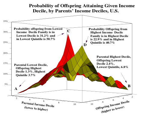
Under some definitions of fair the maximally fair society would give each child an equal chance at various levels of income. In American society if your parents had high incomes chances are your income will be high. A child born of parents in the top 10% has a 40% chance of ending up in the top 20%. If your parents were dirt poor then it’s very unlikely you will have a high income. Children born into the bottom tenth have a 3.7% chance of getting into the top 20%.

The paper includes this great peice of eye candy. This shows the chance a child will fall into a given 10% of the income range given his parents’ position in that range. The two peaks are the poverty/affluence traps.
The fun thing about the paper is the very careful attempt they make to tease out of the data some information about the causality of the intergenerational income status trap. The extent of the trap is really amazing. If you average income over 15 years then the correlation is .65. That means there is a 65% chance that the next generation’s income will be within 1 standard deviation of the previous ones.

Of course what one wants to know is what’s the causal chain from one generation to another. For example maybe the key driver of wealth is a sense of humor (though i doubt it) and parents tend to pass that on to their children a bit by nature and a bit by nurture. The nice thing about the paper is that they make a really substantial effort to draw out of the data as much causality as possible. This is almost impossible since there are plenty of causal chains for which the data is very very thin.

Of course all this stuff is very tangled. Wealthy parents tend to buy more schooling, for example. The trick is to condition the results so you’re getting a reasonably pure contribution from each stage. I.e. so if you doubled the schooling without changing the parent’s wealth your model would predict accurately what the change in outcome would be. That’s really hard. For example it’s common to use data about twins or brothers to try and tease out the differences between nature and nurture. But even that’s very subtle. For example we know the height is very tightly tied to genetics but we also know it varies tremendously depending on how well people are eating. We know that brothers tend to have very similar incomes, unless you partition the data by race at which point you discover that black brothers are extremely highly correlated and non-blacks much less so. They do a beautiful job of stepping thru this mine field.

Here are the numbers they manage to pull out of the data:

  • 4% IQ
  • 7% Schooling
  • 12% Wealth
  • 2% Personality
  • 7% Race

The key result of the paper is that 32% of the trap remains unexplained. It’s something else. Humor say.

I still have an affection for my five ways to get rich model (pick the rich parents, spouse, pocket, card, or trade).

El Curve

I’m thinking that it might be more useful to use the term El Curve rather than Long Tail when we talk about the things with a power-law like distribution. Long tail is a useful term when our focus is reaching out into the long tail; but it frames the discussion in a manner that ignores the role of the vertical portion of the distribution in the architecture of the systems we build.

I’m reading the cheerful provocative book “The Fortune at the Bottom of the Pyramid,” which is about this very question. How can we architect business models that span from the vertical edge down into the horizontal edge to create economic growth thru-out. The book is targeted at the leaders of multi-national corporations. It wants to sell them on the idea that selling into the long tail of the world’s poor is a great business.

Without question the most politically charged power-law curves are the distributions income/wealth curves. The data is sobering. If I pluck the data out of the book’s pyramid drawing and split the world population into two camps about .1 Billion (1.7%) make more that $50 dollars a day and 5.5 Billion make less. It’s easy to become hysterical.

This book declines to partake of that temptation; his audience doesn’t respond well to that. Instead it’s a set of case studies in classic B school style along with the grand rules of thumb required of such books.

The business models all involve elements all along the power-law curve. A distribution channel if you like, though he calls it a process design. Value generating activities along the curve are orchestrated by the firm that designs, builds, and owns a economic network implicit in the business models. This is analagous to the way a fanchise resturant chain architects a value chain that reachs from the individual store up and into centralized production and marketing facilities. Like all economically stable systems some customer problem is resolved and value is captured in exchange for solving the problem. The captured value is spread along the various stages along the power-law curve.

This book is facinating if your interested in business models that reach into the long tail. In spite of it’s overwrot enthusiastic MBA tone, I’m enjoying it.

Google News Frequencies


This chart shows the data from here as of around 3pm 3/28/05 EST plotted on a linear scale and a log-log scale. Each dot shows how many times a particular media source was selected by the news AI at Google for inclusion on their news summary page. The data doesn’t cover a very long period of time so as you get out on the long tail of sources it gets grainy.

There are 1123 sources in the list. The top 64 sources account for just under 50% of stories posted. To say that another way the elite top 5% of the news outlets generated half the stories the AI selected. The elite 1% of the sources account for 20% of the stories. The #1 source provided 4% of the stories.

Two Washington newspapers are in that top 1%. The Moonie owned and operated Washington Times out scores the Washington Post. Silly AI.

Advertising Channels

I was raised by wolfs, well academics actually, and so it was only very late in life I learned that all stories are required to have three legs: problem, hero, and movement toward resolution. The power of this rule is demonstrated by how far some authors will stretch to fit.  An example is a piece in the current New Yorker.  Where the heroine is an advertising professional, and her problem is the end of the Golden age of advertising.

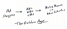
To hear tell in the golden age of advertising little shoppes of advertising artisans lined the streets of Manhattan.  As the curtain rises, desperate mouthwash manufacturing mogels would travel to this village and step into one of these shops.  He would, of course, be carrying a few million dollars.  In the second act the shop owner would craft a campaign and place it on the three television networks. In the third act the American public would tune and discover they had an unfulfilled desire to gargle more. As the curtain goes down they are all placing bottles of mouthwash into their shopping carts at the A&P.

This golden age amuses me. On the one hand you have numerous little firms and on the hand you have three huge television networks. It’s the canonical industry structure. On the one hand you have a highly consolidated distribution channel and on the other hand you have a long tail of tiny producers. In the nostalgic telling this is a beautiful thing. The small firms were wonderful because it they gave free reign (free-range?) to the heroic creative folk. The big networks were wonderful because they had aggregated the audience in a so convenient a package that it took one dance number late in the second act to deploy your campaign.  During this scene money would rain down upon the stage.

To hear tell the golden age has ended.  The advertising industry has condensed.  The entertainment industry is more of a slush.

The article fails, in the end, to fit the required story template.  The article is reduced to an enumeration of the various species emerging in the genus advertising.  Not that, a kind of butterfly collecting, is something the child of academics can appreciate.

Here’s an interesting butterfly: 20 seconds of in-show product placement costs about the same amount as a 30 second ad.  I would have assumed it costs more.  About 40% more is spent on internet advertising than on product placement, but both are growing fast.  Here’s another butterfly: Some newspapers are custom printed at the granularity of the postal code.

Distribution channels fascinate me. Part of my fascination is the way they are fundamentally two faced; the distribution firm must balance between two strong forces. So an entertainment/advertising channel is trying to find a balance between the desires of it’s advertisers and the desires of it’s audience. Actually it’s got three faces, which is even more fun, but let’s gloss over that today.  This tension is the ecology within which these butterflies evolve.

Bewitched, the old sitcom about an ad executive living in the suburbs married to a witch, must be the perfect example of what emerges from an environment with such forces. It’s a show about the customer on both sides of the advertiser/audience channel!  And, it is also the perfect venue for product placement.

The channels in the advertising universe  – defined by the advertisers and audience it attracts – must strike a balance.  Here’s another butterfly: the article tells a story of a TV show in which one of the characters takes a job pitching a product at the local mall, his pitch is identical to the ads spots broadcast with the show.

Billions and billions of ad channels are emerging. Google’s adsense is an example of that. That creates a bloom of new species of advertising channels. Some venues try to maximize how much they serve the advertiser, some try to maximize how much they serve the audience. Some venues don’t even choose to play in this game. The nostalgia for the golden age of advertising is the usual nostalgia for a time when the rules were well understood. The networks defined the audience and the manufactures and advertisers created products and campaigns to fit. Diversity is so confusing.

Long Tail – Wrong Drawing

It’s very odd to be in front of a fad. I’ve spent a lot of time over the last five years looking at the power-law distributions in networks trying to understand the nature of these things. What’s up with elites, the middle class, the poor – or as we have come to call them the long-tail.

One level it’s very exhilarating to have a huge population of people become interested in a topic that fascinates you. But it also involves an odd kind of whiplash. One day your slowly climbing a long tedious learning curve. Off in the distance a few other people are climbing similar hills; you feel a kind of kinship with them. But it’s a big territory and pretty much you all don’t know squat. When the fad breaks a huge crowd rushes into the territory.

This might be great. Many hands make for light work and all that. But the noise level rises and it becomes harder to find the thoughtful ideas. It’s kind of weird how the hordes rush about in this or that region of the landscape; leaving fast territories just as untouched as they were before they all rushed in.

One is torn. Should you continue as before; climbing what ever hills in the problem space that catch your fancy or should you turn and dive into the crowd – where your role would more educational rather than investigative.

For example consider this first image which is becoming the canonical visualization for the long tail. The idea is that the color regions, the bits under the curve, are the value generated by the what ever process is giving rise to this distribution. The red bits are the elite’s generate value; the yellow bits are the value generated by the long tail. The fad is about realizing that the yellow part can be bigger than the red part; in some cases a lot bigger.
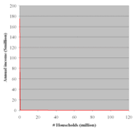

Ok now, look at the real curve. The red line is the whole curve. All the value is in the invisible space between that curve and the x and y axis. The elite value generation is along the y axis while the the poor/long-tail is the value generated along the x axis. That chart is clickable, and here’s another for less political data.

I have a lot of sympathy for the role of the middlemen in the marketplace of ideas. I don’t really see how you can get ideas to move into large populations without their slipping thru the hands of such middlemen. What I don’t get is how bizarre that process really is. Not just that large regions get ignored but even the core of the ideas undergo this severe mutation as they get communicated. Those two drawings are really really different. One is correct, the other isn’t – or a least it is quite a stretch to make it correct.

I can’t claim to being immune to using the exact same rhetorical cartoon. I did it here. If you don’t lie in like this your readers get deeply confused. But, I suspect if you use that cartoon you get get deeply misled as well.

Income Redistribution

Steve Jobs makes an argument I’d not seen before about the structure of the music industry. He argues that the industry’s architecture shifts money down the power-law curve. In effect a few a-list performers make most of the money but the industry has happened on a way to see that the money flows down into the b-list. It does this by signing up lots of b-list acts early in their carriers and then funding that expense from the few that make it into the a-list.

Here’s what he says:

After talking to a lot of people, this is my conclusion: A young artist gets signed, and he or she gets a big advance — a million dollars, or more. And the theory is that the record company will earn back that advance when the artist is successful.

Except that even though they’re really good at picking, only one or two out of the ten that they pick is successful. And so most of the artists never earn back that advance — so the record companies are out that money. Well, who pays for the ones that are the losers?

The winners pay. The winners pay for the losers, and the winners are not seeing rewards commensurate with their success. And they get upset.

From a God like point of view this might be very healthy for the industry. An architecture that starves out all your b-list performers isn’t likely to generate a deep pool of talent that occasionally bubbles up an a-list winner. It’s an entirely reasonable deal that’s offered to the b-list players; we make you reasonably wealthy but in the unlikely scenario that you make it into the a-list your going to help fund all your b-list peers.

Notice that Jobs doesn’t say the industry is screwing the performers. He only says that the ones that make it into the a-list often feel that maybe they shouldn’t have taken the deal. He doesn’t say that the industry is stealing the cash the a-list is making; only that they are shifting it down to the b-list.

Wealth redistribution is one of the standard ways that you can temper the power-law curve. There are good reasons to want that. Starving the pool of talent isn’t a very good long term plan. The architecture Job’s outlines is good for the performers; lowering their life time risk and raising their chances of working in the profession of their choice and it’s good for the industry because it creates a more reliable pool of talent to draw upon.

This is the same framework you find inside companies with their ornate job classifications. In any give time frame some high achievers subsidize the salaries of the low achievers in that time frame. Since high achieving is such a crap shoot of variables the structure tends to compensate for the randomness. It spreads risk for both the employer and for the employees.

This is the same framework that union contracts strive to achieve. A degree of tempering the risk in the out years by spreading the wealth across the union members and turning down the capacious nature of the market.

There is a lot of enthusiasm these days for shifting risk out of social structures and onto individuals. There are reasons not to do that. Reasons that everybody involved might well sign onto. I see lots of benefit in societies with a less severe wealth distribution. I find it sobering how fast we are tearing down these structures.

Jobs’ model implies that the a-list performers are bitter about the deal they made. In the context of the music industry they have limited legal options for renegotiating that deal. What’s a pain in the neck about modern politics is that the a-list can renegotiating the terms of the social contract buying enough senators. In the short term this makes the a-list richer, in the long term it starves out the long tail. That’s not good.

Design Patterns for Intermediaries

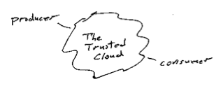
Between producers and consumers you need to insert some sort of exchange, a trusted intermediary. I’ve always liked the way that people draw this as a cloud. It suggests angels are at work, or possibly that if you look closely things will only get blurry and your glasses will get wet. Even without getting your self wet things aren’t clear even from the outside. For example what do we mean by trust? Does it mean low-latency, reliability, robust governance, low barriers to entry, competitive markets, minimal concentration of power – who knows?

There are some leading design patterns for working on these problems. Sometimes the cloud condenses into a single hub. For example one technique is to introduce a central hub, or a monopoly. The US Postal system, the Federal Reserve’s check clearing houses, AT&T’s long distance business are old examples of that. Of course none of those were ever absolute monopolies; you could always find examples of some amount of exchange that took place by going around the hub – if you want to split hairs. Google in ‘findablity’, eBay in auctions, Amazon in the online book business are more modern examples.
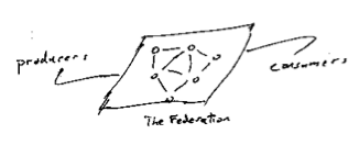
In the blog update notification space the hub originally was weblogs.com, but for a number of reasons it didn’t retain that role. Today the cloud’s structure is kind of lumpy. There are lumps on the producer side and the consumer side. On the producing side all the majors have aggregated a supply of pings; for example Typepad presumably has a huge supply of pings, WordPress comes out of the box pinging Ping-o-matic. On the consuming side big players aggregate pings as well, some of these are evolving toward or are explicitly in the role of intermediaries. The blog search sites are a good example (Pubsub, Feedster, Technorati). They all labor to discover fresh content. The trends seems to be toward condensation. Industries in this situation often, given time, create some sort of federated approach.

Federated approachs are clearly more social than hubs. In markets where the participants are naturally noncompetitive they can be quite social. For example when national phone companies federate to exchange traffic, or small banks federate to clear checks or credit card payments. That can change over time, of course. The nice feature of a federated architecture is that it helps create clarity about where the rules of the game are being blocked out. How and who rules the cloud is part of the mystery of trust.
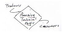
There is a third school of design for the cloud, what might be called “look mom no hands” or maybe technology magic. The first time I encountered that one was the routing algorithms for the Arpanet; but that’s another story. These techniques go by various names; just to pick a few P2P, distributed hashing, multicast. The general idea for these is that the N participants all install a clever lump of code; these clever bits then collaborate (using elegant ideas) and a routing network emerges that makes the problem go away.

The magic based solutions have great stories or illustrations to go with them. For example the early Arpanet architecture had each node in the net act advertise it’s service to it’s neighbors who would then shop for the best route – boy did that not work! I worked on on three multiprocessors in the 1970s that had varing designs for how to route data between CPU and memory. One of these, the Butterfly, had a switched who’s topology was based on the Fast Fourier Transform.
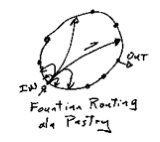

Recently I’ve been reading some papers about a system that uses what you might call fountain routing. All the nodes are arranged as peers around a circle. Packets bounce thru a few nodes to get where they are going. Each node has a few paths to distant parts of the circle and more paths to it’s neighbors. The illustration shows one node’s routes. A packet entering at that node would get thrown toward a node closer to it’s destination that node will have more routes to even closer nodes.

The monopoly/hub designs are social only to the extent that a monarchy a social structure. The federated designs are social in the manner of a town meeting or the roman senate. The technical magic solutions are social in the sense the sense that they take as a given that everybody will sign up to the same standard social contract. Each of these social architectures has it’s blind spots. For example the federated design can easily lock out small players because they can’t get a seat at the table. Magic technical solutions seem to break down when the traffic patterns stop behaving what ever their designers presumed. E.g. as the blogging example demonstrates the real world is rarely high trusting, random, uniform, collaborative, and peer to peer.

Ping/Poll why they don’t scale

Off an on for the last few months I’ve been playing with the problem of how web sites notify their reader producers-exchange-consumerswhen they have fresh content. This is sometimes called the Ping problem. Sometimes it’s called push, to contrast it with the typical way that content is discovered on the net i.e. pulling it from it’s source. The problem interests me for an assortment of reasons, not the least of which is that it’s a two sided network effect. On the one side you have writers and on the other side you have readers. I draw a drawing like the one on the right for situations like that. Two fluffy clouds for the producers and the consumers connected thru some sort of exchange.
The design problem that I find fascinating is the exchange. For example you could build a single hub, or a peer to peer system, or possibly something based on standards. Lots of choices both technical, social, and economic.

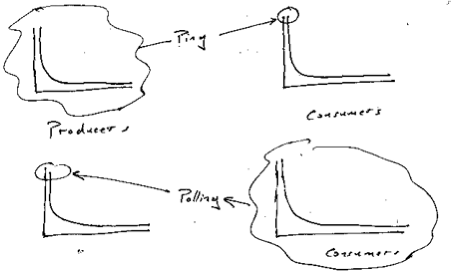
The set of producers has some very exceptional members. For example if you limit the problem to just blogs then Blogger and Typepad together probably account for a huge slice of the pie. Similarly some consumers have a huge appetite for content. Google, Technorati, Feedster, etc. want to read everything! These two populations are skewed, i.e. their power-laws. I draw a picture like this to illustrate that.

The blogging example provides a nice case study for the more general problem. In that community we currently have two standard solutions to the problem. Both don’t scale. Ping, which let’s producers notify a handful of sites when they update, was originally designed to notify a single site (and now a handful of sites) of updates. While it serves the voracious readers well it doesn’t scale up to help the rest of the readers. So the rest of the readers use polling to check if sites have changed. It’s a curious counter point that polling is a pain in the neck for the elite producers; in effect it enlists the long tail of readers into a denial of service attack on them.
Illustration showing how Ping serves high-volume consumers while poll stresses high volume producers.

While it’s not hard to construct conspiracy theories when working on problems like this, it is also foolish to ignore that powerful winner take all games are in the room. The shape of the distributions creates that high stakes game. It’s critical that the design take the distributions and traffic patterns into account. The Ping/Poll design is that it’s elites on the consuming side benefit while the elites on the producer side suffer. I’d be amazed if that was intentional!

Fascinating problem.