Monthly Archives: January 2014

Beveridge Curve Mystery Explained

The Beveridge Curve names a correlation between supply & demand for talent/labor.  When the demand for talent (as measured by job listings) is high then the supply  (as measured by unemployment numbers) is low.  And visa versa.  If you ignore the red dots you can see what a nice correlation this is.  That seems unsurprising.


On the other hand the red dots are surprising.   Something bad happened in the current recession.  The supply of jobs increased but the unemployment rate didn’t fall as epected. But what?

This posting over at the WSJ provides a clue.  Just split the pool of unemployed into two camps.  Apparently the long term unemployed need not apply.  Why this is true in this recession and not others is food for thought.  That clearly needs a handful of insta-theories.

Who knew that the Right’s efforts to stop helping the long term unemployed are in fact merely an effort to defend the lovely honor of the Beveridge Curve.

Mysterious changes in driving behavior

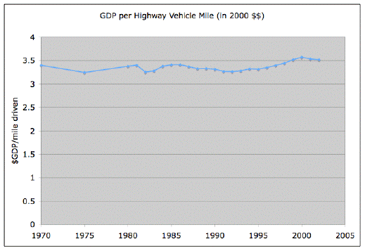
A long time ago I was bewildered by a chart at the Oil Drum which showed that miles driven was basically perfectly correlated with GDP.  Here’s that chart.  In the years since I’ve occasionally thought that maybe it’s flat because Y axis is lousy.

oildrum_vehicle_productivity


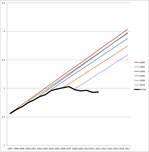
This topic came up again.  Andrew, who is particularly interested in the inability of various actors to accept that they got it wrong, pointed out that the traffic planning folks have got their projections wrong for a while.  He reposts this damning “fan chart.”

VMT-C-P-chart-big1-541x550

Andrew’s post lead to an interesting, if cynical, conversation in the comments, which in turn triggered Raghuveer Parthasarathy to revisit that the correlation; updating the range, tidy up the axis, etc.  He posted these three charts.

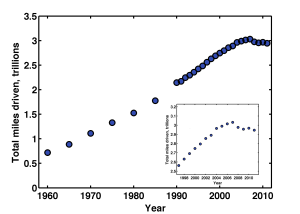
First we have total miles driven.  Clearly something happened, i.e. this awful recession.  And maybe something happened to create a slight bend in the trend from the range between, say, 1995 and 2006.  I think that’s what the inset chart is intended to help clarify.  It’s odd that miles traveled appears to rise around the dotcom bubble burst.   That was not the case where I live!  What ever that four years is odd.   The lack of any recovery after the recession is a puzzle too.

total_miles_driven_with_inset


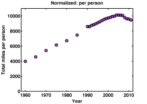
The second chart is miles/person.  Now the lack of recovery post 2008 is even more striking.  Those last four dots seem to suggest that drivers are becoming dispirited.  Let’s blame Facebook?

milesperperson


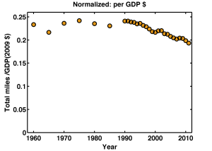
And now the miles/$-gdp.  This is the oil drum chart updated with 10 new years of data.  But, yeah, the overlapping portions of the two charts do not agree with each other.  Weird.

Again we can see the odd four years around the internet bubble.  And, curiously this chart seems to shows that miles/gdp rises a bit around a recession   It’s a lagging indicator?

But of course the most fascinating thing is that there is a twenty year trend of less driving per GDP dollar.  I have a sickening feeling that’s the rise of the bank’s share of the GDP, but who knows?

milespergdp


Like my facebook or banking suggestions it’s not hard to find people making up other insta-theories.   Aging population.  Or: Have you tried to get a drives license recently, it’s a PIA!  Youth unemployment.  Student loan debt.  I don’t doubt there are professionals that think about this much more carefully than I can.  I’d love to know what they think.

Underutilization: labor

The Bureau of Labor Statistics has six different ways to measure unemployment, and there are many more.  Here is a table of those six showing them for the states.  I was interested in how large the gap is between the measures.  So here’s a picture.  Notice that in states with a large supply of jobs the gap is small and as the supply weakens you get larger numbers of people who have had to settle for jobs they don’t really want.  For example part-time when they want full-time.

This includes two metro-regions (LA and NYC) and the 50 states is 51 because it includes DC.  The last four points are DC, Nevada, LA, and NYC.  The first four are North and South Dakota, Nebraska, and Wyoming.  I’m not clever enough to scale the points by population.   Puerto Rico is not shown.

Note that U-3 is the “official” number.  U-1 and U-6 are on the chart.

If you aspire to squeezing the most out of the pool of labor/talent then U-6 sets a goal.  But even that is low because these days a large segment of the population has dropped out of the labor pool entirely.  Presumably they would come back if the supply of jobs increased.

That 20% number in LA is amazing.  The 3.8 million people in LA is more than half the states.

Unemployment numbers

This essay on the recent unemployment numbers is a pretty reasonable attempt to walk the line between the two “consensus” opinions about the economy.  I.e. “It’s could be better but there is steady improvement.  Oh yeah, inflation is concern.”  v.s. “Seriously stagnant man!  Oh yeah, that people are suffering is a concern!”

I found this chart particularly interesting.


Group forming: flocks of selfies

cow-workers

People do love to signal their membership in the groups they are enthusiastic about.  Here a tumbler where farmers can post their selfies.  Presumably this will trigger some “entrepreneur” into creating a site for “selfie of class” collections which he will then sell for a billion dollars to linked-in, google+ or whatever.

fyi – please don’t confuse selfies with avatar 🙂

Campbell’s Law

Campbell’s law: “The more any quantitative social indicator is used for social decision-making,” he wrote, “the more subject it will be to corruption pressures and the more apt it will be to distort and corrupt the social processes it is intended to monitor.”

So true, and it also tends to drive out other things. … (ht: karim)

openssh on Mountain Lion via brew – grumble

I don’t recall why but I installed brew’s verison of openssh using the instructions here on my OSX 10.8.5.   10.8.5 is Mountain Lion.

Ssh stopped working.  ssh -v revealed it would hang at “debug1: SSH2_MSG_SERVICE_ACCEPT received” which after I while I traced down to a hint that ssh-agent might be wedged.

Sure enough launchd’s org.openbsd.ssh-agent was failing.   Console was reporting: ” (org.openbsd.ssh-agent) Throttling respawn: Will start in 10 seconds”, a lot.

This failure arises because the org.openbsd.ssh-agent plist passes a -l switch to ssh-agent, and the one brew provided doesn’t have this undocumented switch.  You can see the switch in apple’s variant, just look for l_switch.

There are assorted pages complaining about this problem, but no solution.  My solution was to change the org.openbsd.ssh-agent plist to use the apple version of ssh-agent that resides in /usr/bin/ssh-agent.

I think I’m happy now.

Continuous v.s. Batch: The Census

Log, from Blamo: Civil War Reenactor

Log, from Blamo: Civil War Reenactor

I am enjoying this extremely long blog post about how logs can form the hub for a distributed system, by Jay Kreps from Linked-in.  It’s TLMR “too long, must read?”  It reminds me of my post about listening to the system, but more so.

He has a wonderful example of batch v.s. continuous processing.  A dialectic worthy of its own post at some point.

The US census provides a good example of batch data collection. The census periodically kicks off and does a brute force discovery and enumeration of US citizens by having people walking around door-to-door. This made a lot of sense in 1790 when the census was first begun. Data collection at the time was inherently batch oriented, it involved riding around on horseback and writing down records on paper, then transporting this batch of records to a central location where humans added up all the counts. These days, when you describe the census process one immediately wonders why we don’t keep a journal of births and deaths and produce population counts either continuously or with whatever granularity is needed.

Cute.  My goto example has always been the difference between the annual cycle(s) that arises from agriculture and tax law revisions v.s. the newspaper’s daily cycle in service of the demand for fish wrapping.

jobscalculatedriskBut of course that’s not really continuous, it’s just batch with different cycle times.  And yet I once encountered a continuous system that involved a pipeline across a desert.  Each time the sun would emerge from behind the clouds the pipe would warm up and a vast slug of material would be ejected out the far end into a hastily build holding pit at the refinery.  Maybe slug processing would be a good fall back term for the inevitable emergence of  batches in continuous systems.  Blame the clouds.