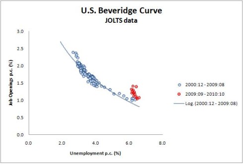
The Beveridge Curve names a correlation between supply & demand for talent/labor. When the demand for talent (as measured by job listings) is high then the supply (as measured by unemployment numbers) is low. And visa versa. If you ignore the red dots you can see what a nice correlation this is. That seems unsurprising.
On the other hand the red dots are surprising. Something bad happened in the current recession. The supply of jobs increased but the unemployment rate didn’t fall as epected. But what?
This posting over at the WSJ provides a clue. Just split the pool of unemployed into two camps. Apparently the long term unemployed need not apply. Why this is true in this recession and not others is food for thought. That clearly needs a handful of insta-theories.
Who knew that the Right’s efforts to stop helping the long term unemployed are in fact merely an effort to defend the lovely honor of the Beveridge Curve.

