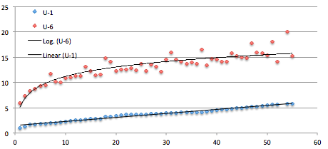
The Bureau of Labor Statistics has six different ways to measure unemployment, and there are many more. Here is a table of those six showing them for the states. I was interested in how large the gap is between the measures. So here’s a picture. Notice that in states with a large supply of jobs the gap is small and as the supply weakens you get larger numbers of people who have had to settle for jobs they don’t really want. For example part-time when they want full-time.
This includes two metro-regions (LA and NYC) and the 50 states is 51 because it includes DC. The last four points are DC, Nevada, LA, and NYC. The first four are North and South Dakota, Nebraska, and Wyoming. I’m not clever enough to scale the points by population. Puerto Rico is not shown.
Note that U-3 is the “official” number. U-1 and U-6 are on the chart.
If you aspire to squeezing the most out of the pool of labor/talent then U-6 sets a goal. But even that is low because these days a large segment of the population has dropped out of the labor pool entirely. Presumably they would come back if the supply of jobs increased.
That 20% number in LA is amazing. The 3.8 million people in LA is more than half the states.