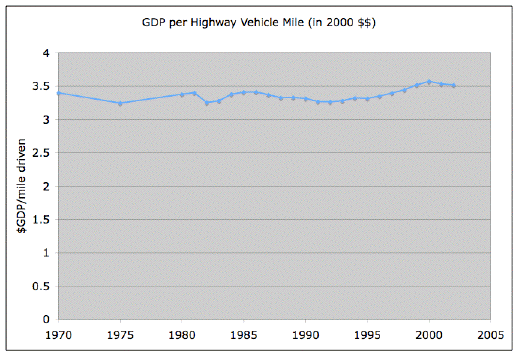
A long time ago I was bewildered by a chart at the Oil Drum which showed that miles driven was basically perfectly correlated with GDP. Here’s that chart. In the years since I’ve occasionally thought that maybe it’s flat because Y axis is lousy.
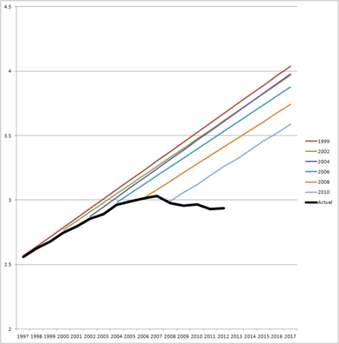
This topic came up again. Andrew, who is particularly interested in the inability of various actors to accept that they got it wrong, pointed out that the traffic planning folks have got their projections wrong for a while. He reposts this damning “fan chart.”
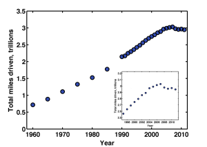
Andrew’s post lead to an interesting, if cynical, conversation in the comments, which in turn triggered Raghuveer Parthasarathy to revisit that the correlation; updating the range, tidy up the axis, etc. He posted these three charts.
First we have total miles driven. Clearly something happened, i.e. this awful recession. And maybe something happened to create a slight bend in the trend from the range between, say, 1995 and 2006. I think that’s what the inset chart is intended to help clarify. It’s odd that miles traveled appears to rise around the dotcom bubble burst. That was not the case where I live! What ever that four years is odd. The lack of any recovery after the recession is a puzzle too.
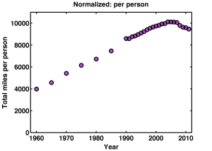
The second chart is miles/person. Now the lack of recovery post 2008 is even more striking. Those last four dots seem to suggest that drivers are becoming dispirited. Let’s blame Facebook?
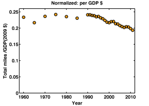
And now the miles/$-gdp. This is the oil drum chart updated with 10 new years of data. But, yeah, the overlapping portions of the two charts do not agree with each other. Weird.
Again we can see the odd four years around the internet bubble. And, curiously this chart seems to shows that miles/gdp rises a bit around a recession It’s a lagging indicator?
But of course the most fascinating thing is that there is a twenty year trend of less driving per GDP dollar. I have a sickening feeling that’s the rise of the bank’s share of the GDP, but who knows?
Like my facebook or banking suggestions it’s not hard to find people making up other insta-theories. Aging population. Or: Have you tried to get a drives license recently, it’s a PIA! Youth unemployment. Student loan debt. I don’t doubt there are professionals that think about this much more carefully than I can. I’d love to know what they think.
