Author Archives: bhyde

Signed Downloads

I must be wrong, but apparently there is no well tooled standard way to manage trust for digital artifacts.  Consider an example: the instructions for installing Ruby’s rvm tool look like this:

curl -sSL https://get.rvm.io | bash

That’s wonderfully simple, although it implies a lot of trust in get.rvm.io!

I run into this problem a lot. For example I have scripts that help me configure virtual machines. Here’s one that installs a hyperdex that I run as I’m setting up a new machine.

cat <<'EOF' > /etc/yum.repos.d//hyperdex.repo
[hyperdex]
name=hyperdex
baseurl=http://centos.hyperdex.org/base/$basearch/$releasever
enabled=1
gpgcheck=0
EOF
yum clean all
ls -l /etc/yum.repos.d/
yum --assumeyes install hyperdex
ls -l /etc/yum.repos.d/

I then do something like this on a fresh machine:

curl http://example.com/install-hyperdex.sh | bash -

I can share these scripts, but I’d be loath to entice people into the bad habit of running such things.

And this bad habit is becoming very common.  For example Continuum Analytic’s amazingly cool python data tool suite and it’s extremely useful tools for managing python versions and packages is conveniently installed by downloading a 16 megabyte shell script which you then cheerfully hand off to bash.

Of course there are systems that help with this mess.  Yum will check gpg signatures, and it’s lame that says “gpgheck=0”.   But why am I unaware of any tools that make it straight forward to check signatures on scripts like my install-hyperdex.sh script, or Ruby’s script for installing rvm. What I want is a tools that lets me tell users something like this:

To install Awesome-Software do this:

run-remote-script http://example.org/install-awesome-software

If you don’t have run-remote-script see how to install it by visiting …

Obviously we could ask users to step thru longer instructions.

To install our awesome software first be sure you have installed gnupg. Then download our signing key into your keyring.

curl https://example.org/our-signing-key.asc | gpg --import

Now you can download our install script and check that we signed off on it.

# Get the script.
curl -o /tmp/foo http://example.com/install-thing.sh.asc
# Verify it's signature looks ok.
gpg --verify $/tmp/foo

If that looks ok, then extract the script and run it.

sed -e '1,3d' -e '/-----BEGIN PGP SIGNATURE-----/,$d' /tmp/foo | bash -

That will work … if you don’t want users.

Why is this so damn hard?  As I said at the start: we have “no well tooled standard way to manage trust for digital artifacts”.  For heaven’s sake I had to use sed to extract the script!

One part of the answer would seem to be that systems like homebrew, ports, rpm, yum, etc. etc. are all trying to solve a larger problems.  Which is fine, but they fail to address my problem, or the problem the rvm team has, or the problem that the python data guys have.

I have tooled up some of this, for my own needs when building virtual machines. But, it’s hardly a useful tool for others.  And, it’s very much a work in progress.

Gosh, I feel like somebody must have already written a tool analogous to “run-remote-script.”

Fear, Risk, and the Labor Pool

The Right in a disgusting and all too typical turn of events twisted a recent CBO report on the Affordable Care Act into a political talking point.  The act has made it easier and more affordable to get health insurance.  And insurance is now less tightly linked to having a job.   You might say that’s great, but not if your on the Right.  Nope, on the Right this is bad.  Why?  Because, as the report  mentions, this empowers some people to drop out of the labor force.

The sadism of this line of reasoning is horrific.  It treats the labor force as cattle.  What is government’s role?  Coerce them into the job market.   Healthcare is just a stick to herd them.

But worse it’s stupid because even if you decide to treat ’em like cattle it’s insane to focus on only on quantity.   What about quality.? A rancher with more cattle, unhealthy cattle, is not wealthier than the rancher with fewer cattle.

This talking vile point has legs!  Child labor laws reduces labor force participation!   Education funding reduces labor force participation.  Social security … what other social welfare programs reduce labor force participation.

I wonder, what social program was the mother of all job killers?   Extending the franchise?  The emancipation proclamation?

Restores

This talk, which I only listened to, about the Forbin Project’s Google’s systems for back up and restore was fun.  It just lets you glimpse little bits of what is obviously an elephant.

It is unsurprising but sad how extremely proprietary the computer industry has become.

Here are the things I enjoyed in the talk, particularly the first two.

  • He hinted that they can use encryption key management to delete customer data without the bother of erasing all the backup fragments.
  • It’s all about the restore.  That’s when the system comes under intense scrutiny.  So it must be fast and automated.   So much of the design evolved after that pressure became clear to them.
  • They replicate, ala RAID 4, the restores across tapes.  Bad blocks identified (or suspected) are repaired
  • They do regular restore testing  (5% ?).
  • Replication/redundancy is necessary over many dimensions, not just copies.  Geography, mechanism, … but he didn’t enumerate the dimensions.
  • He hinted that to speed restores they might use only half tapes, since that reduces seek time. Though if you think about it you’ll see that you can sort the tapes so redundancy blocks are in the 2nd half.
  • They do ship data physically.
  • Logistics planning is obviously a thing.

I would have loved to get a brief overview of the API they deliver to the systems that utilizes their services.  Particularly the introductory material that outlines the contracts you can negotiate via configuration and what then are your responsibilities as a user of the services.  There are some very slight hints about that, but not much.

The multi-dimensional aspect to redundancy got me to wondering if they have a backup exchange agreement with other big Sky Net operators.

The talk and questions is an hour and fifteen minutes.

Beveridge Curve Mystery Explained

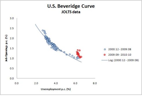
The Beveridge Curve names a correlation between supply & demand for talent/labor.  When the demand for talent (as measured by job listings) is high then the supply  (as measured by unemployment numbers) is low.  And visa versa.  If you ignore the red dots you can see what a nice correlation this is.  That seems unsurprising.


On the other hand the red dots are surprising.   Something bad happened in the current recession.  The supply of jobs increased but the unemployment rate didn’t fall as epected. But what?

This posting over at the WSJ provides a clue.  Just split the pool of unemployed into two camps.  Apparently the long term unemployed need not apply.  Why this is true in this recession and not others is food for thought.  That clearly needs a handful of insta-theories.

Who knew that the Right’s efforts to stop helping the long term unemployed are in fact merely an effort to defend the lovely honor of the Beveridge Curve.

Mysterious changes in driving behavior

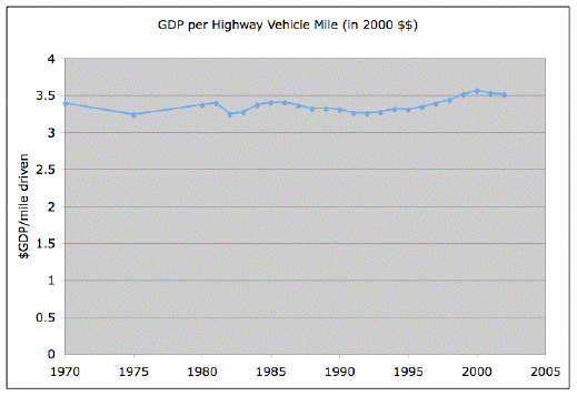
A long time ago I was bewildered by a chart at the Oil Drum which showed that miles driven was basically perfectly correlated with GDP.  Here’s that chart.  In the years since I’ve occasionally thought that maybe it’s flat because Y axis is lousy.

oildrum_vehicle_productivity


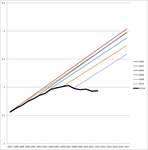
This topic came up again.  Andrew, who is particularly interested in the inability of various actors to accept that they got it wrong, pointed out that the traffic planning folks have got their projections wrong for a while.  He reposts this damning “fan chart.”

VMT-C-P-chart-big1-541x550

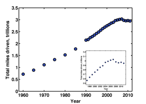
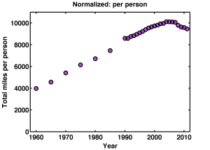
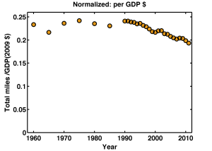
Andrew’s post lead to an interesting, if cynical, conversation in the comments, which in turn triggered Raghuveer Parthasarathy to revisit that the correlation; updating the range, tidy up the axis, etc.  He posted these three charts.

First we have total miles driven.  Clearly something happened, i.e. this awful recession.  And maybe something happened to create a slight bend in the trend from the range between, say, 1995 and 2006.  I think that’s what the inset chart is intended to help clarify.  It’s odd that miles traveled appears to rise around the dotcom bubble burst.   That was not the case where I live!  What ever that four years is odd.   The lack of any recovery after the recession is a puzzle too.

total_miles_driven_with_inset


The second chart is miles/person.  Now the lack of recovery post 2008 is even more striking.  Those last four dots seem to suggest that drivers are becoming dispirited.  Let’s blame Facebook?

milesperperson


And now the miles/$-gdp.  This is the oil drum chart updated with 10 new years of data.  But, yeah, the overlapping portions of the two charts do not agree with each other.  Weird.

Again we can see the odd four years around the internet bubble.  And, curiously this chart seems to shows that miles/gdp rises a bit around a recession   It’s a lagging indicator?

But of course the most fascinating thing is that there is a twenty year trend of less driving per GDP dollar.  I have a sickening feeling that’s the rise of the bank’s share of the GDP, but who knows?

milespergdp


Like my facebook or banking suggestions it’s not hard to find people making up other insta-theories.   Aging population.  Or: Have you tried to get a drives license recently, it’s a PIA!  Youth unemployment.  Student loan debt.  I don’t doubt there are professionals that think about this much more carefully than I can.  I’d love to know what they think.

Underutilization: labor

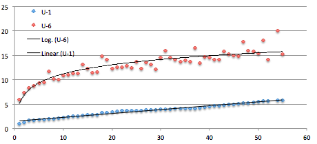
The Bureau of Labor Statistics has six different ways to measure unemployment, and there are many more.  Here is a table of those six showing them for the states.  I was interested in how large the gap is between the measures.  So here’s a picture.  Notice that in states with a large supply of jobs the gap is small and as the supply weakens you get larger numbers of people who have had to settle for jobs they don’t really want.  For example part-time when they want full-time.

This includes two metro-regions (LA and NYC) and the 50 states is 51 because it includes DC.  The last four points are DC, Nevada, LA, and NYC.  The first four are North and South Dakota, Nebraska, and Wyoming.  I’m not clever enough to scale the points by population.   Puerto Rico is not shown.

Note that U-3 is the “official” number.  U-1 and U-6 are on the chart.

If you aspire to squeezing the most out of the pool of labor/talent then U-6 sets a goal.  But even that is low because these days a large segment of the population has dropped out of the labor pool entirely.  Presumably they would come back if the supply of jobs increased.

That 20% number in LA is amazing.  The 3.8 million people in LA is more than half the states.

Unemployment numbers

This essay on the recent unemployment numbers is a pretty reasonable attempt to walk the line between the two “consensus” opinions about the economy.  I.e. “It’s could be better but there is steady improvement.  Oh yeah, inflation is concern.”  v.s. “Seriously stagnant man!  Oh yeah, that people are suffering is a concern!”

I found this chart particularly interesting.


Group forming: flocks of selfies

cow-workers

People do love to signal their membership in the groups they are enthusiastic about.  Here a tumbler where farmers can post their selfies.  Presumably this will trigger some “entrepreneur” into creating a site for “selfie of class” collections which he will then sell for a billion dollars to linked-in, google+ or whatever.

fyi – please don’t confuse selfies with avatar 🙂