Category Archives: power-laws and networks

Platforms, Standards, & Hubs

Joel on Software is the nice web site of a small buisiness owner. Joel’s company makes two kinds of software: some for web site content management, and some for helping organizations coordinating their work.

I have a good friend who is curious why some people will freely reveal their trade secrets. For example open source authors. Joel freely reveals a lot about how he runs and thinks about his company: a great example of free revealing, but Joel’s not an open source guy. He’s trying to make a living.

One of his recent essays is a particular favorite of mind.
In his essay on complementary products Joels gives a particularly nice peak into how large businesses work to comoditize the industries around them. For example platform vendors work very hard to create a vibrant community of complementary products that add value to their platform.

One reason I’m interested in these things is that software platforms are almost indistinquishable from industry standards and I’ve come to believe that one way to look at Open Source is as a new forum for coordinating the creation of standards. If you’re into this kind of thing then Joel’s complaints about one platform vendor’s pricing model and the vendor’s response are great examples of the push and pull around this stuff.

Of course that Joel’s site apparently is lacking an RSS feed does give one pause. 🙂
Web Visitors per Month

webvisitors.gif

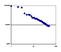
Web traffic per site was the first place I noted a power law distribution in the web. Back then (1997?) Alexia used to have a chart showing this. This chart illustrates that. It’s taken from this data source, it’s the table in that press release labeled “U.S. Top 50 Internet Properties”).

The vertical axis is visitors per month, and horizontal is the rank. The top three, who are neck and neck, are AOL, MSN, and Yahoo. The top of the chart would be 100 million visitors per month!

Earthquakes the Power-Law

Are you doing disaster planning for earthquakes, or a telecom industry meltdown? Can you treat them the same?
The article mentioned in the prior posting implies the folks at eBay do.

Do they have similar distributions?

Indeed they are quite similar. This graph shows how the distribution of earthquakes vs. scale is another power law curve. Most of the energy(wealth) is reserved for the very rare very huge earthquakes.

Humm… what about tornados.

Population v.s. Income

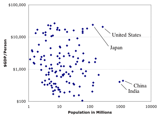
This chart has one dot for each nation on the planet. One axis shows how many people live in that nation. That’s why China and India are on the far right. The vertical axis shows how productive that nation is, per person, so that nations like the US, and Japan are near the top. This is a log-log graph, so there are huge variations across its span.

gdb_pop.gif

Nothing about this graph tells you how evenly the is wealth distributed within those nations.

Last name hit parade

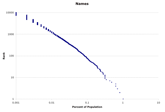
This chart shows the population of individuals in the US sorted into buckets. One bucket for each last name. One dot for each bucket. Only the three thousand most popular names are shown.

last_name.gif

The axis on the left shows how popular a given name is, while the bottom axis shows what percentage of the population has that name. Both axis are log scales.

My last name, for example, is aproximately number 1000 on the last name hit parade. The bottom axis shows what percentage of the population enjoy that name, i.e. nearly .01 percent of the population.

This data comes from the US Census, say thank you! Try your name.

The striking thing about this chart is how smooth and straight it is (the choppy part at the upper left is due to how the data only had three digits after the decimal point). This pattern is known as Zipf’s Law and it appears in a lot of data involving systems with large interacting populations: words, cities, etc. etc ) where there is some ‘competitive advantage’ for the larger subpopulations.

Productive around the World

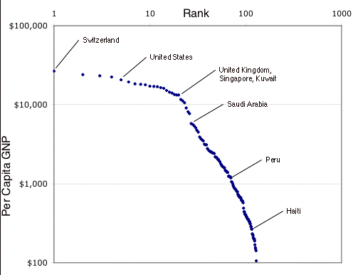
The following chart has one dot for every country on the planet. The vertical axis shows how productive a country’s citizens are. For example, people in Peru produce around $1000 per year. The countries are ordered from left to right, in rank order, so the most productive country Switzerland is first. The least is just off the graph on the right. The chart is a log log graph! There are lots of poor countries; some are frighteningly poor.

pp_gnp.jpg

These straight lines on log-log graphs of ranking in populations appear in lots of situations. For example in the distribution of wealth, the popularity of words in languages, or the sizes of cities. These go by different names; power-law, zipf’s law, Pareto’s law because it was noticed in different situations.

What do these things have in common?

The simple awnser is that this happens in systems where, over time, the rich get richer. If the system’s evolution gives some advantage to the better off then curves like this will settle out of the random processes that grow the system. Consider a city; if it’s got people those people will tend to breed and it’s population will grow; if there is something attractive about that crowd of people more people will be attracted; if we have few such positive reenforcements that and time is all we need.

Of course if these are systems created by human goverments then we somebody maybe tinkering with the rules. That can make the rich get richer faster or slower. I suspect that the top of that curve illustrates how the top few countries aren’t such separate countries when it comes to this measure productivity.

Where is the Internet?

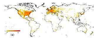
This map shows where the Internet Routers are, and hence
where the Internet is.
router_density.jpg

Like the map of what is lite up at night it suffers from tendency to under represent thd dense areas and to over emphasis lightly populated areas with wealth enough to have Internet service brought to them.

People & Light

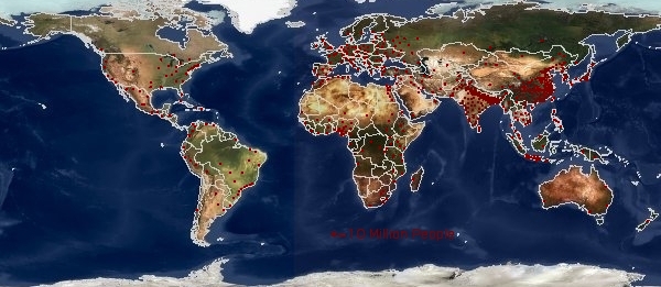
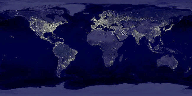
These two images show where people live, and who has sufficent wealth to turn the lights on at night. Respectively these show where to go if you like people, or if your afraid of the dark.

Each Dot denotes Ten Million People:

Were nighttime lighting is used:

On the population map notice Nigeria, Indonisia, the Ganges, China, the Mexican American border, the coast of Brazil, South Africa. On the map of night time lighting notice the lights along the Siberian Railroad, and odd way that the Brazillian coast line seems dark. Areas where the population is spread out and which have some money seem to be better lite – the American midwest is the most stricking example since nobody lives there. India is very thought provoking contrasted with Bangladesh.

Illustrations of this kind have a problem on both the low and the high end. The eye -or in the case of the night lights the camera – tends to give more credit to the lightly provisioned. On the high end overlapping dots can be extremely misleading; for example exactly how many 10 million person dots are piled up in the Bangladesh? Another interesting example of this is this large map showing the population around Boston, MA, USA with very small (a hundred people each) dots. Even with the small dots the map gets overwhelmed downtown and the bright red tends to make the rural areas seem more populated then they really are.

Thanks to Brian DeLong’s collection of graphs and illustrations found here: Semi-Daily Journal