This chart shows the population of individuals in the US sorted into buckets. One bucket for each last name. One dot for each bucket. Only the three thousand most popular names are shown.
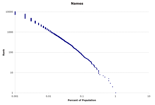
The axis on the left shows how popular a given name is, while the bottom axis shows what percentage of the population has that name. Both axis are log scales.
My last name, for example, is aproximately number 1000 on the last name hit parade. The bottom axis shows what percentage of the population enjoy that name, i.e. nearly .01 percent of the population.
This data comes from the US Census, say thank you! Try your name.
The striking thing about this chart is how smooth and straight it is (the choppy part at the upper left is due to how the data only had three digits after the decimal point). This pattern is known as Zipf’s Law and it appears in a lot of data involving systems with large interacting populations: words, cities, etc. etc ) where there is some ‘competitive advantage’ for the larger subpopulations.
test
The “Try your name” link isn’t working for me (as of 2002-06-30 23:25 EDT).
Apparently the entire census site goes down from time to time; so if it doesn’t work you’ll just have to try again later..