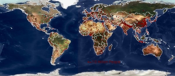
These two images show where people live, and who has sufficent wealth to turn the lights on at night. Respectively these show where to go if you like people, or if your afraid of the dark.
Each Dot denotes Ten Million People:
Were nighttime lighting is used:
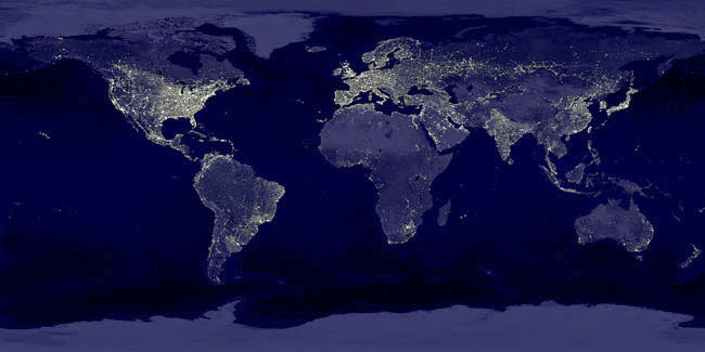
On the population map notice Nigeria, Indonisia, the Ganges, China, the Mexican American border, the coast of Brazil, South Africa. On the map of night time lighting notice the lights along the Siberian Railroad, and odd way that the Brazillian coast line seems dark. Areas where the population is spread out and which have some money seem to be better lite – the American midwest is the most stricking example since nobody lives there. India is very thought provoking contrasted with Bangladesh.
Illustrations of this kind have a problem on both the low and the high end. The eye -or in the case of the night lights the camera – tends to give more credit to the lightly provisioned. On the high end overlapping dots can be extremely misleading; for example exactly how many 10 million person dots are piled up in the Bangladesh? Another interesting example of this is this large map showing the population around Boston, MA, USA with very small (a hundred people each) dots. Even with the small dots the map gets overwhelmed downtown and the bright red tends to make the rural areas seem more populated then they really are.
Thanks to Brian DeLong’s collection of graphs and illustrations found here: Semi-Daily Journal
You are invited to check the pages dedicated to click here here everywhere – Tons of interesdting stuff!!!