Monthly Archives: January 2010

Postie

I’m inordinately happy to  have finally puzzled out how to enable posting to my blog via email.  The last few times I’d tried to get this to work something or another ruined my fun.

WordPress tempts you into thinking that you can post by email.  But the built in mechanism is flawed in enough ways to make it dead to me.  E.g. –  can only handle simple mail formats, it can only hand unencrypted POP3, and finally didn’t work at all.

But, happy day the  wordpress plugin Postie works for me.

It’s a bit complex to get all the toggles set right.  For example I rarely send email in rich text format, but in this case it’s worth it since the converter will handle all the formating.  Including images.  Floating images!

WordPress tries hard, but the image editing is really too tedious, and its editor is fine; but not as good as the one in my mail program.  And, my mail program there has grammar checking.

Getting all the settings right is delicate.  By default you need to email from the same account you WordPress user id is associated with.  And, you may need to change the email address associated with your admin account for that to work; since I assume it picks the first account it finds.  You will want to check that your blog knows what time zone it’s in, that’s on the general WordPress settings page.  There is also a setting in Postie, but fix the blog’s setting first.  It helped to toggle the “preferred text type” in the postie message settings to “html.”  And you’ll need yet another email account.

Initially I had all the email originated postings filed under “drafts,” and I recommend that until you think you have all the bugs worked out.  But, I’m somewhat sad admit, I still fiddle with the final result by hand.  In particular it isn’t quite getting the paragraph breaks right.

Daily Energy Storage

The drawing at right is the schematic of an air conditioner based on phase change.  In this case wax that melts at 22C (72F).  The wax is encapsulated in tiny spheres and then mixed with water to create a fluid.  That slurry is pumped thru the radiator (labeled: cool-phase condensing rods).

At night cool outside air is used to solidify the wax, and during the day inside air is cooled by melting the wax.  This is analogous to how I cool my house; cooling it at night and sealing it up during the day.  I let the building provide the thermal mass.

They claim you can use it to store heat over night, but I assume that’s only going to work if you warm the house over 72F during the day.  But maybe the slurry is a mixture of wax for different temps.

They can store about 4kWh of energy the slurry.  That’s not a lot as air conditioning loads go (a medium sized room?); but they claim the capital cost per cubic meter and much lower operating costs.

The manufacture is currently testing units around London.  The box looks like a clunky old steam radiator.

So, interesting that a daily cycle, room sized, phase change scheme might show up in the market soon.  There are daily cycle, office building, phase change schemes where in a block of ice is frozen each night.  I’ve thought it would be a hoot to build something similar that was yearly cycle, and house sized.  More here.

Notarized Public Revealing

I don’t really do Facebook, but back when it first emerged I wrote a few apps and kicked the tires a bit.  One application that I admired, but which is sadly now dormant, was “Awareness Ribbons”.  It let you plop a block into your profile with ribbons for all your assorted causes.  They had hundreds of different ribbons.  I find this kind of public revealing of affiliations fascinating.  In particular I found the idea of a middleman being involved interesting.

Anybody can assert that they are concerned about Feral Cats or what ever your ribbon might signal.  The cost of membership is zero, so the quality of the signal is hard to assert.  Around town I see a lot of people sporting the ring they bought late in their senior year at Harvard or MIT.  I sometimes thought it would be fun if I could pick up a few such rings in pawn shops.
In some imaginary future we will have digital documents that we can present to assert membership in various clubs.  These will be signed by the club, making them a bit harder to forge.  Standards for that are, of course, a substitute for a middleman.  Or maybe we will just get a middleman instead; a commercial notary public.
So it was with interest that I notice  something that Tumbler is doing something along these lines.  Tumbler users can make a donation to one of a few charities, and in return they get a ribbon added to their avatar.  It appears you could just upload an avatar to which you have added your own ribbon, but that’s easy to fix.
Clearly the old Facebook app could be reborn with this added feature.  You only get to display the ribbon of your cause after you donate something thru the application.  The middleman could then work with the clubs to set the terms for that.  In fact any of these social sites that aid the public revealing of self could include features along these lines.

Is advertising spend as skewed as income?

We know how skewed the distribution of wealth and income are. But I suspect that if you had data about the flux of advertising dollars you would discover that those dollars are targeted disproportionately at tail of the distribution.

I gather that it is well known that if you look at the ads in a given newspaper of magazine the ads are targeted toward the high end of their readership. Hence the ads for thousand dollar watches in the New York Times.

Possibly selling into the high end of the distribution is so lucrative that you don’t really use advertising as most of us think of it. The selling channels are different; you give talks at Ted and get booth space at the superbowl.

Which makes me wonder how different the ads are if my IP address is in 10028 (Upper East Side of Manhattan, avg income $227K/year) v.s. 10454 (South Bronx, avg. income $18K/year).  There must be advertisers who have figured that out.

Buying in Bulk

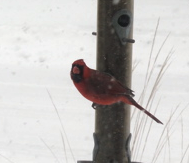
I gather that my mother in law once bought a case of dog food only to have the dog die.  We recently bought a big bag of bird seed and now the birds have disappeared.

I was watching a talk about “grit”, which I think the rest of us would call perseverance.  And the speaker was explaining the usual story about how it takes 10 thousand hours of dedicated practice to become an expert in something.  It’s hard to find anything in computing that’s lasted ten years.  There are somethings.  Those guys really don’t fit in.

World Mapper

I continue to be a fan of the cartograms at world mapper.  And I see they now have regional and national maps.  For example here is one where the grid squares are proportional to the  population across the Caribbean.

And another for  population in the US.

(with luck this will be the first posting done via the  Postie plugin for WordPress, which pulls email (rich text in this case) via inserts it into your drafts, published, or whatever.  You can grab a free email from one of these services, just be careful to get one with imap or pop3 support.)

Haiti

This map shows the risk of earthquakes for areas in the  Caribbean.

And this is the same map showing Haiti more closely

And this map shows where the first earthquake struck, and the following map shows one of the aftershocks.  The capital city Port-a-Prince is labeled on the second map.

Those are ‘shake maps’, estimates of how severe the shaking was.  The dark red is ten, or X, and here’s what the key says:

VIII - Drivers have trouble steering. Tall structures such as towers,
monuments and chimneys may twist and fall. Wood frame houses that
are not bolted to their foundations may shift and sustain serious
damage.  Damage is slight to moderate in well-constructed buildings,
considerable in poorly constructed buildings. Branches are broken and
fall from trees.  Changes occur in flow or temperature of springs and
wells. Cracks appear in wet ground and on steep slopes. 

IX - Masonry structures and poorly constructed buildings suffer serious
damage or collapse. Frame structures, if not bolted, shift off
foundations. Serious damage to reservoirs.  Underground pipes broken.
Conspicuous cracks in the  ground. In alluvial areas, sand and mud
ejected and sand craters are formed.

X - Most masonry and frame structures destroyed along with their
foundations.  Some well-built wooden structures and bridges are
destroyed.  Serious damage to dams, dikes, and embankments. Large
landslides occur.  Water thrown on the banks of canals, rivers and
lakes.  Sand and mud shift horizontally on beaches and flat land.
Rails bent.

Those mountains are huge, four thousand feet.  So the population is more densely packed than this map suggests.

You can see there is an extremely densely populated valley crossing the peninsula very close to the epicenter of the first quake.  But that doesn’t really agree with this population map, which I tend to trust more since they care more about how population is actually distributed.

The contour lines, in blue, on this map, are at thousand foot intervals.

Ok, here is a profesional effort to estimate the population exposure.  Click here to see the map.

As usual the Globe’s Big Picture has excellent coverage.

Shortly after Katrina NOAA took detailed arial photographs of the entire gulf coastline and put them up on the web.  Does anybody knows of a similar effort for Haiti?

Boo!

I recently subscribed, and more recently unsubscribed, from the local news feed from the Boston Globe.  It was awful!  Almost every article was targeted straight at the readers reptilian brain.  Just one scary story after another.  If you read that crap day after day you won’t trust anybody.  They even had a story that would lead you think your girl friend might just kill you and cut your unborn baby from your belly.  Just awful!

There really needs to be a term of art for this kind of – ah – entertainment.  The dynamic where news outlets fall progressively into picking out only those stories that get a rise out of their readers worst fears is  despicable.  Terror porn news?

Consider for example this article from the 2005 from the Times of London “Britain faces big chill as ocean current slows.”  I think they wrote that to fufill their objective; the one filed under: shock the bourgeoisie.  But,  given that I know the media’s first instinct is to try to route around my rational brain and try to kick my poor  reptilian  brain in the balls.  How am I to discount that information?

And, talk about modeling a bad behavior!  How much stuff I read seems to fall into this pattern.  I used to explain to my children that the educational value of watching Mr. Bean was that you should absolutely never ever do anything he does.  Since then I’ve come to think that actually applies to all television, possibly to all entertainment; and today I’m thinking all media.  Oh no, where does it end!

Europe chills and Greenland warm

This passionate posting over at Daily Kos caught my attention.  So I’m trying to understand the  fundamentals  a bit more and ignore the passion.  The first image shows a warm current of ocean water sweeping up the west coast of Greenland.  The posting suggests this is tied up in the recent snows in England and makes the usual suggestive tie to global warming.  All in all it made me curious.

This first map shows the major currents of the North Atlantic.  If you look at the eastern sea board of the US you’ll see the gulf stream, in warm red, flowing up the coast.  Below that a cold blue stream of water flows south.  The Gulf stream begins life in the Gulf of Mexico, while the cold current begins along the coast of  Labrador.

You’ll notice that the Gulf stream pumps a lot of warmth into the ocean around England, Iceland, Norway.  The trade wind plays a key role in that.  (Read about the North Atlantic Oscillation to get a feel for the drivers of those trade winds.)    The winds sweep west to east across the seas south of Iceland drawing warmth from the Gulf stream depositing it into British Isles, and Europe.

The second map shows the currents in more detail.  You can see that some of of the gulf splits off and is drawn up around the tip of Greenland and then along up the west coast of Greenland.

These days we have  satellites  that can report on the  temperature  of the sea’s surface, so called SST.  And that can then be plotted either by  temperature SST, or by how much the temp has varied from the usual SSTA. In the alphabet of worry A is for  anomaly.  The third map shows how much the surface temp. is anomalous compared to the seasonal average.  Uou can see the current that wraps the bottom of Greenland is about one degree warmer than usual.  That map is for Jan 6th.  You can keep an eye on it if you want, there are some cool animations there, but not of the anomalies.

But I suspect that this happens when ever they get a serious round of cold weather in Europe.  It does presumably increase the ongoing of glacier retreat along west coast of Greenland.

The nightmare scenario is that the Gulf stream stops warming Europe.  But the story above starts with a cold spell in Europe; not the other way around.  I can build scenarios with positive feedback loops in them using only the above; but they seem pretty  tenuous  and uninformed to me.