Some nice illustration of income inequality pulled together at Visualizing Economics. For example this shows a fine grain map of US income inequality. Oh I’d love to see a video of that over time!
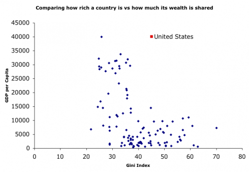
Or this scatter plot nations showing the height of inequality v.s. their per-capital GDP. The US, an outlier, is highlighted.
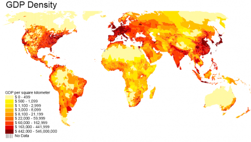
Lots of thought provoking stuff over there, for example this fine grain map what real estate is productive. I wish this was GDP/capital.
The original sources can be found in the postings I pulled these from; though sadly many of the links are broken.


Hmm – only 48 of the 50 states that make up the “United States” (nor are the territories shown) – so the title of the Map is wrong. Surely for showing data such as this it is appropriate to do so correctly.