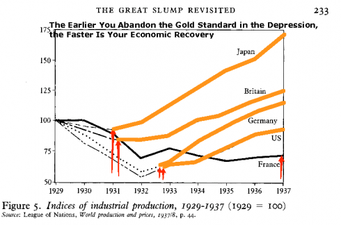
This first chart shows the economic growth of various nations during the years of the Great Depression. The red arrows show when each nation abandoned thier commitment to extremely ‘sound money’ as represented by the gold standard. (The original source pdf.)
This second chart is about the current recession. It shows the correlation between the level of fiscal stimulus and GDP growth in various countries. Aggressive stimulus leads to a faster recovery.
I have wondered how much that first chart is all you need to know about why we ended up at war with the Japanese. Word for the day: calutron.


whats the new ‘ boost’ then
after youve used up gold-decoupling and credit-insanity mojo
Cloud computing, of course.
Pingback: Ascription is an Anathema to any Enthusiasm › The Tale of the Traitorous Story