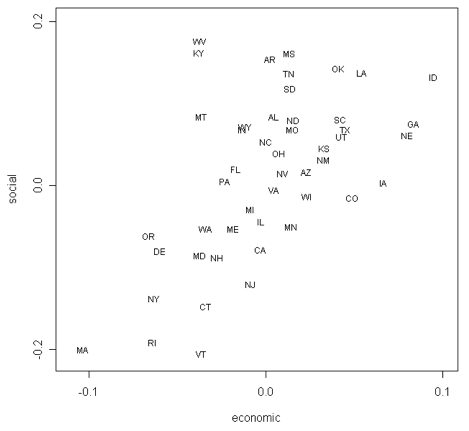
Recall the counter intuitive result that you can explain the vast majority of all voting behavior with only two metrics, i.e. the vote view model. The two metrics range liberal to conservative and one is economic, one is social. There is a mystery, at least to me, about these two metrics. You don’t really need the social metric to explain most congressional votes. Yes, the accuracy of the model improves some by adding the social metric; but not tremendously. So why do we expend so much time ranting about the social dimension? It’s a disconnect between the talk and the action.
These charts show an average adult (sic) for these two metrics; one point per state. This data is new to me, I’ve only seen two dimensional vote-view scatter plots for individual legislators. It would be fun to have error bounds on the points, it would be fun to see the spreads between the voters and the population at large, it would be fun to have dots scaled to electoral votes.
One way to frame up the mystery is to say that we talk about social issues, but legislators act on economic ones to such a degree that we have the same disconnect seen between of signal-value use-value for in sexy but unreliable sports cars. The sexy bits sell the product, but the actual product delivers something else. That kind of thing isnt’ unusual, i.e. say/do ~ signal-value/use-value ~ social-values/economic-values.
No doubt there is a framework that explains when the signal-value and use-value of a product tend to diverge. For example when the feedback loop delivering information about the use value is broken, or when the buy decision is emotional and impulsive. I bet there is something here that is interesting to be dug out about political activism.
It’s interesting to see charts showing these metrics for the buyer side of the electoral process.

Wow. I knew I lived in a liberal state; it’s just … startling to see just *how* liberal you can measure it with a reasonable data set.
Mmmmm, Mass and Idaho, complete opposites! There’s a good joke to be dug up in the bogs or potato fields there, I’m sure. But I already knew I never really needed to visit WV again, anyway.
I agree having the broader data sets expressed in the graph would be even more interesting. Well, pretty, at least.
Damn Vermont; they beat us out on social.
One thing to imagine is drawing the line that cuts the plane in half and gets a liberal elected. It’s hard without Ohio, but it looks doable without Ohio. Food for thought, that.
This is horrible chart. What does 0.1 mean [most liberal or most conservative] ? What does 0.2 mean ?
Katie – Horrible? Click on the link re. ‘vote view model’ to get a description of what the two axis mean.
Pingback: Ascription is an Anathema to any Enthusiasm › Voteview: Supreme Court
Pingback: Ascription is an Anathema to any Enthusiasm › Polarization in the state legislatures.