This is fun! This Java app displays the ebb and flow of popularity for the top thousand first names. Names are distributed in a power law; so the top thousand are the elite names.
Notice how you don’t, glancing at this display, get any sense of how huge the space of names really is or how dominate the top few are. For example the display can only show the first 100 or so in it’s initially. Another example of how blind to the long tail we usually are.
I find it fascinating how many people I know who’s names do not appear at all on this display at all. I guess that’s a good sign. (See also.)
It’s extremely hard to visualize these power-laws populations. It would help a lot if this chart included a strata for all the names not broken out in detail.
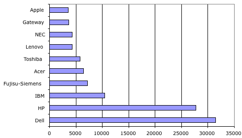
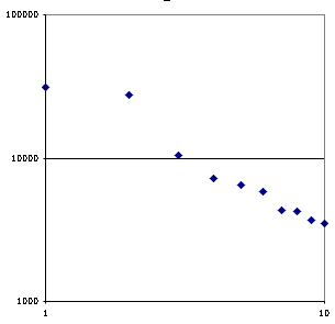
Here’s a good example of that problem. This table shows the top N vendors of personal computers along with the number of units they are estimated to have shipped. The log-log plot shows that this industry is, like most industries, power-law distributed (particularly if you gloss over the transitional situation around HP and Dell).


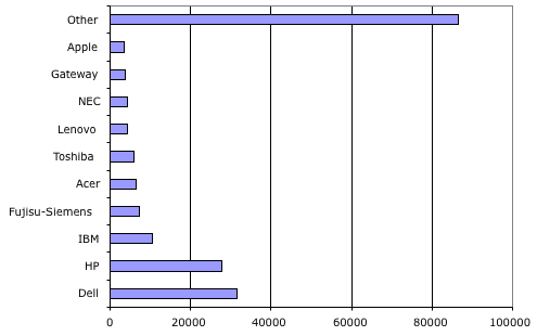
So that ought to make us suspect that there is a long tail of PC producers that aren’t shown in that data. How big is it? Well it’s approximately half the the industry.

Other is important!
When this data was recently released all the articles talked about the horse race between Dell and HP. But isn’t the actual horse race between these few firms and all the others? I wonder what the trends are for the long-tail category. Last year it was a few percentage points larger. I wonder why? Which players prefer a large other category? Could that be the real story behind IBM’s sale of it’s PC business; they prefer a large other in this a complementary business.
I wonder if anybody has looked at the trends in the first name data. Are we growing more or less diverse over the last century. (Update: Oh look a paper on the drift in baby names and it’s distribution (pdf))