Category Archives: General

ice storm

Look (update: opps, we used up all his bandwidth) at this unbelievable photo from this set about the recent ice storm in the high plains. Those are individual stems of stray covered in ice thicker than your two fists!

Meanwhile here in Boston it’s 70 degrees and doubling amazing the sky is perfectly blue. In the winter warm usually comes with wet, very disconcerting.

Dyslexia, another model and a therapy

I suspect my readers have figured out I suffer from dyslexia, well regarding that this work by Gadi Geiger, Jerry Lettvin, and others is thought provoking.

They found interesting visual test you can run to test for dyslexia. You have the subject stare at a dot a screen, and then you briefly flash a single letter in place of the dot. At the same time you also flash another letter a some distance away from the centered letter. You then ask the subject to enter the two letters. A series of these samples allows you to build a map of how the subject’s visual focus ranges across his visual field.

Not surprisingly people skill at catching that second letter varies with how far from the centered letter it appears. But dyslexics, apparently, tend to drop off more rapidly in near the center while they are better at catching the letters further off from the center. This matches up nicely with the experiance of dyslexia, i.e. that it’s difficult to see the individual words and one is often skittering about on the page noticing items that if you could manage your attention more successfully would be ignored. I also am amused by how this ties into some of the stuff I’ve been thinking recently about attention managment.

They also noticed that the focus of attention across the field of vision is shaped differently for people who read English v.s. Hebrew (which is read left to right).

They also noticed that dyslexics who have managed to learn to be effective readers, like me, will have one mode when they are attentive and another when they are fatigued. Boy I’m familiar with that syndrome.

Based on this test, and optimism about the plasticity of the brain, they invented a little therapy to try. They cut a hole in an index card so that only a dozen letters of text were visible and asked some kids with dyslexia to try reading through that window for a few weeks.  This turned out to be amazingly effective! Presumably it trains the visual system to attend more closely to the material near the point were your reading.

Update: Having attended a talk by Geiger it appears that description is missing a critical element; i.e. they also asked the kids to engage in an art/craft activity that involved fine motor and eye coordination.  Follow on studies have indicated this is a necessary component of the therapy.  Why exactly they included this complementary activity is unclear to me, but it helps explain why nobody stumbled on the therapy before.  Gadi suggested it was an intuitive move; possibly triggered by some studies done in the years before this.  Those studies showed that active hand/eye interaction made a substantial difference in people’s ability to compensate for the effects of silly goggles that did things like shift your vision six inches to the right.

I want to note that this approach doesn’t attempt to treat the cause of dyslexia. The visual field anomaly is a symptom and the therapy treats that symptom. Dyslexia has other symptoms, for example there are significant phonetic aspects which make it miserable to learn a foreign language, recall names, or repeat words you hear.

Reading thru a window also used in some speed reading schemes; see for example this demo of RSVP and if you like that try this this Firefox extension.

I wrote an emacs mode that simulates their index card.

Weak Governance

One spectrum you can map governance failures onto is too-weak/too-strong.  For example publicly traded firms often fail by excessive aggregation of power into the hands of the senior executives.  Since there’s no meaningful oversight because the shareholders are highly fragmented, disinterested, and not particularly loyal.  So over time more and more governance decisions default to senior management; and thenbad things can happen.

I’ve been thinking about this through the example domain of condo associations; using the examples Evan Mckenzie posts on his blog.  The too-hot examples in that sphere are condo managers who become little dictators.  I don’t doubt there is a great comedy movie waiting to be made about them.

Much more common I suspect are the failures of governance the too-cool kind.    Since I first read Evan he has come to be concerned that these associations often (almost always) a financial time-bomb. That almost none of these associations are prepared to deal with the huge costs that will arise shortly when their infrastructure requires costly repairs.  There are millions of these, because for example on my house is a two unit condo.  Though of course some of them approach the size of small cities.

Our little garage roof is an example of a financial time bomb.  We should have fixed 20 years ago but now it’s rotten and the whole thing will need to come off before it collapses onto the cars.  This ain’t going to be cheap and nobody I know is interested in volunteering to project manage the job.  A lot of these places were built on the cheap and sold fast, and in some of the big cities they sold off portions of the public housing stock to their poor residents.  When those roof fails the residents won’t have my resources to deal with the problem.  It’s a failure of my imagination that I can’t see the comedy movie waiting to be made about too little governance.

The in the condo associations the worse case scenarios of weak governance failures often require that the state step in.  If the condo is forced to fix the roof and then can’t pay for it the courts will put them in receivership and the receiver will send the owners a bill that will bankrupt them.  Here’s another example: the timesharing association was so weak that they didn’t pay their taxes and so the state sold the property.  Apparently they are still disputing who ought to have been notified before the sale happened, the association board, or the horde of people who bought tiny time share slices?

Regional Wealth

These highly skew’d distributions are extremely hard to visualize; you just can not get a feel for how vast the population of “other” is.  I give some examples of that in this previous posting, using people’s names as an example.

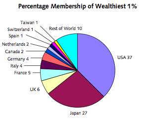
The folks that wrote the recent report on the worldwide distribution of wealth take a run at the problem in the usual way; putting the data into various buckets.  For example  they know that 40% of the total wealth of the planet is held by the richest 1% of the population.  We can make a pie chart showing were they live.  They live in the Europe, the US, and Japan.  In this visualization you can’t see the other, i.e. the vast majority of the world’s population, the other 99%; notice how China, India, Africa, etc. are all invisible on this chart.
wealthtop1percentworld.png

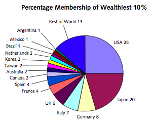
We could try to get a picture that shows these other folks by making a series of pie charts.  For example we might make ten charts each showing 10% of the world’s population.  For example this next chart shows the richest 10% of the world’s population; and where they live:
worldtopdecilepie.png

Korea, Mexico, Agentia, Brazil showed up; but still no sign of China, India, Africa, etc.    The report’s authors found a way to address the problem by making the chart below.  This chart displays a pile of similar pie charts.  The first pie chart above is the chart you get if you take convert the right edge of the chart below.

worldregionalweathshares.png

So this shows that India, Africa, and “Other Asia-Pacific” house most of the world’s poorest.

But yet the visualization problems remain.  Notice two things.  First, that 40% of the total wealth is held by a tiny tiny sliver running along that right edge.  Secondly, that these regional buckets are very misleading.  Even inside those regions only a very tiny minority of the population is wealthy.  See if you can figure out what slice shape denotes a higher or lower Gini for that region?

World Distribution of Household Wealth

I feel duty bound to post about the recently released report on the worldwide wealth distribution put out by the “World Institute for Development Economics Research” at the United Nations University in Finland.  There is little in this report that surprises me.  Wealth is very skewed.  For example: “the study estimates that the global wealth Gini for adults is 89%.  The same degree of inequality would be obtained if one person in a group of ten takes 99% of the total pie and the other nine share the remaining 1%.”

The skew varies widely from country to country.  If there is some central authority in charge, let’s call him Zippy, Zippy might decide to reward some people with more wealth than others.  Zippy might pick any of an assortment of basis for his rewards: talent, birth, luck, effort, beauty, behavior, height, power, etc.  The Gini index is a metric of how big much Zippy decides to reward.  If he hands out no rewards then the Gini index is zero and the wealth is perfectly evenly spread out; if the index is one then he picks on person and given them all the money.
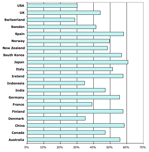
The chart below, derived from table 9 in the report, shows an alternate way to look at what Zippy has done in various countries.  It shows how much wealth the bottom 90% captured.
wealthshare90.png
Zippy likes the rich.  He really likes them in the US and Switzerland.  He’s a bit nicer to everybody else in some other countries, for example in Japan, China, and Spain.

Yield Curve

Through history there has been many ideas about of how to value the future. I particularly love one of these ideas that the interest paid on borrowed money is the compensation you pay the lender for his pain in forgoing the pleasures that money could have purchased him.

In any case modern financial market have numerous schemes to allow you to price a bushel of corn or money at some point in the future. If you borrow money, for example, you pay interest. Interestingly if you borrow money for a year v.s. ten years you don’t pay the same interest rate. Sometimes you pay more sometimes you pay less. If we plot these various interest rates we get what’s known as the yield curve.

There is a very cool applet showing the yield curve for the last few decades in this magazine article.

The shape of the yield curve is a market signal about what people think the economy is going to do next. Short term rates go up when there is lots of demand for cash, i.e. their are lots options for investing your cash that will bear fruit quickly; i.e. the economy is hot. If at the same time the market collectively senses that economy is going to cool down, i.e. there aren’t good long term investments to be made, then the near term cost of money should be higher than the long term cost. That’s the case right now.

Presumably this means that investors have their attention focused on short range opportunities v.s. long range ones. When they look at longer range investment opportunities the see uncertainty and so they put their time into activities that can be wrapped up in a short, presumably more predictable, time frame.

The yield curve is the market signal that tells us what the investor class is thinking about the future; with the consumer spending and confidence tells us what they are thinking. The market signals says that we live in an uncertain world. Who knew?!?

Missing the Train

I spent a huge slice of my life writing toolkits for graphical user interfaces. The primary tension in that work is between supply and demand; the software engineering knowledge available and the interfaces you wish to build.

Strong opinions on both sides. Engineering loyalists prefer more objects in the design. Have a chart? Give every point on a chart it’s own object. Customer loyalists wanted it implemented quickly (more objects can help there) and very very fast (more objects are no help there). A more difficult tension from the customer side the desire for pretty, easy, and powerful.

Both camps have factions within; the most striking one is between professionals and practitioners, e.g. those who study the problem and those who build commercial systems to actually solve the problem. Few commercial system builders are aware of the work done in labs on constraint based UI tool kits. Intellidraw was a shining exception. Few people working in the labs have a clue about the elegant architecture of the Apple Newton’s UI toolkit.

I haven’t working in this domain much for more than a decade now. I moved on. The UI toolkit design space seemed to be largely mined out. Worse, powerful network effects had locked in solutions patterns.

I moved onto the open source puzzle, i.e. how to leverage the infinite pool of talent on the other side of the internet. A much richer vein of opportunities to mine. Still is!

Has the academic UI community come to this new party? The answer appears to be no and that is so weird!

I don’t see these applications through the old paradigm. Model on one side and user on the other and the designer’s job is to fill the gap with view & controller. Meanwhile the researcher stands off to one side attempting to make the interaction more … whatever, more efficient, more fun, more smooth.

These days I see an artifact on one side and a group on the other. The artifact plays a key role in the group dynamics; as a point of rendezvous, the manifestation of it’s common cause. View/control is no longer a particularly useful way of thinking about that problem. I have other ways I now think of it: coordination, community rituals, games, limited warfare, etc, etc.

While there are numerous practitioners of this new craft with thousands of examples of wonderful systems already built (source control, wikis, forums, bug trackers, IM systems, etc.). So where, damn it, are is the professional faction? This train left the station a while ago; and with a few very specialized examples it looks like they missed the train entirely.
Self Binding

In Arizona you can relinquish your right to go into Casinos by signing an agreement after which the Casino operator can toss you off the premises. That’s presumably a sign that you don’t trust your self to avoid the temptation. In California there is a town where you can relinquish your right to drive your car at night. I guess that’s a sign that you don’t trust your teenagers? Maybe it’s a sign that your really are paranoid about thieves. Or maybe it’s a scheme to keep mom from sneaking out the craft supply store. When you buy real estate in a gated community you sign away a vast range of freedoms, as you do when you move into a carefully zoned neighborhood. Of course there is the movement to have young people sign pledges that they will behave in a particular ways ranging from behave in class, through do their homework, up through abstain from sex until marriage.

All these are strategies to control the behavior of the parties involved. We all know that short term pleasures do tend to displace long term benefits. These schemes are necessary because we don’t trust our neighbors, our children and most interestingly ourselves! Optimal impulse control is extremely hard.

We all make “personal rules” that mimic the systems above because we don’t trust our future selves. This lack of trust is based on experience; in what makes for a variation of catch 22, if we had kept to our personal rules in the past we wouldn’t need them.

Mark Twain decided to limit his smoking to one cigar a day, for his health, and found that over time his cigars grew larger until the rule lead to the added benefit that he could use his cigar as a cane should the need arise. One of W.C. Fields characters, a temperance lecture would explain that he keep a bottle of liquor at close at hand. For snake bits only! He also kept close at hand a snake.