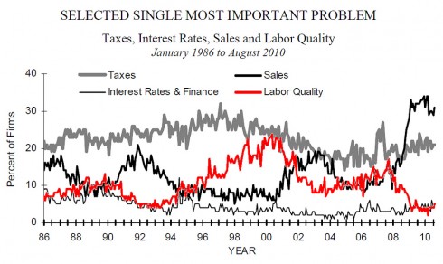
If it wasn’t so bleak I’d find this chart amusing. I love the idea that we can reduce the worries of business owners to just four things; for sake it doesn’t even call out the five things that your freshman business major is is taught to worry about. It is obvious this data series was intended to server a anti-government anti-tax PR agenda.
The second thing I notice is that two of the curves (taxes and finance) are sufficiently constant as to be uninteresting. The only signal in this data series is just the business cycle – when things are hot the problem is finding good people; when they are lousy the problem is sales.
Sadly this is a horribly bleak chart. It shows that the recession is just awful. It’s the worse in 25 years, at least. It also shows who tightly coupled demand for goods is to demand for labor. Of course it’s not surprising that if you can’t sell your don’t worry much about finding good labor. One way to look at that red line is that it hints at what percentage of firms are hiring.
If we don’t find a way to crank up demand, e.g. sales, we are in for a long a miserable decade.

Do you have to make that conclusion, esp. in the light of your previous post?
Perhaps there is some “metrics management” going on, where consumer or producer sentiment is seen as an input into the economy rather than an output of a lot of things (the economy, the weather, how good the baseball team is, etc).
I’d also like to see that same graph with error bars inserted; dollars to donuts, the random fluctuation you see really is noise.
And don’t forget the coupling between the labor and sales: fired people can consume way less, thus reinforcing the cycle: when companies have prospects of low sales, they stop hiring or even fire part of their employees, which **causes** low sales, and so on…