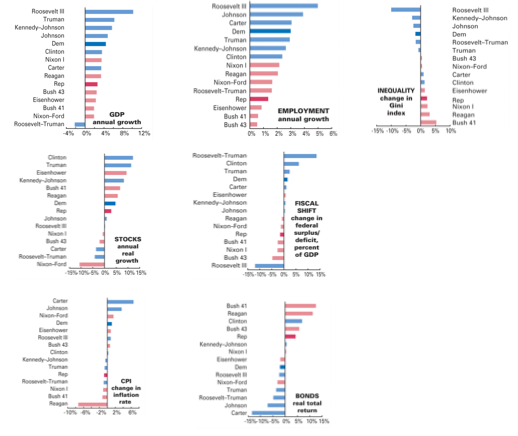
We have known about these charts for a while now; i.e. there is a sharp difference between how the economy changes under Democratic v.s. Republican presidents. The economists have apparently made no real progress on explaining why.
Note how the cartoon Republican, i.e. the cigar smoking plutocrat, apparently votes against his interests.

Has anyone posted charts like this including their source data?
Even better, done so in a web2.0-y way?
I mean, seriously: they took some economic indicators – presumably big spreadsheets, in many cases government data and freely available – and graphed them. Where’s the soon-to-be popular website that does this, but sticks a bunch of Simile or other visualization tools atop them so at least we can instantly see all the simple effects the detractors are talking about.
Choosing source data is separate subject. But even arguing over “a president can’t influence anything in the first two years anyway” issue could be simply solved if we could just drag the time scale over by 2 years, and then see where the charts land.
The idea that scholars would reveal their data is catching fire almost as fast as web sites revealing _full_ APIs, i.e. it ain’t happening except in the most exceptional cases. I wish I was more confident that both were a certain outcome.