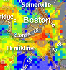
 These heat maps of the price per square foot for real estate (in so far as they are accurate) are very cool. Cleveland appears to have very uniform prices (but that maybe dynamic range); while Chicago has very extreme ones.
This is nicely complemented by this very old example of the same idea: London in the 1890s, which is a, I believe, just about the beginning of this kind of thinking.
But really it’s impossible to get a sense of the scale of things.