The chart below shows the five year rise a housing price index for the top handful of metro regions.
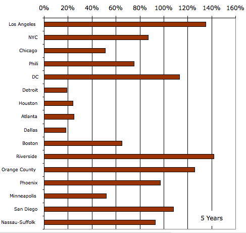
Presumably some of the varation from one region to another is grounded in fundamentals while some is irrational exuberance.
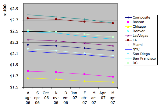
Meanwhile one of the future’s markets has a thinly traded product you can buy. In a perfectly functional market that would be your best estimate of what the future holds. This chart shows the price as of yesterday for a contract on a somewhat different housing index for various dates in the future. You can see that they are all falling, but also that there is little variation from one region to another; at least nothing to compare to the variation in historical price rises.
This was all triggered by reading a story this morning of a seller in Washington who entered the market asking 1.1 million and sold after an auction for half that.