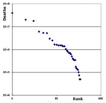
 This is another addition to my collection of data about things that have a powerlaw in distribution. This one shows major conflicts of the 20th century and uses deaths/conflict as a measure of their intensity. In a sense this is a continuation of the distributions shown in an earlier posting that display the intensity inside of two smaller conflicts. The paper behind that posting was making the case for conflicts have a fundimental nature which is reflected in the distribution.
I’m becoming more interested in puzzling out what the slight variations from a perfectly straight line have to say. This example is a good one for that because it really isn’t particularly smooth. Of course one possiblity is that they mean the distribution isn’t really powerlaw at all and it’s just an artifact of the sorting; but in those cases the variablity tends to be much higher than here. Sometimes the problem is that you just don’t have enough data; while this data is complete it is only for a single century. Rounding and other reporting bias is always a problem; the straight bit for conflicts with 1.5 million dealths is typical of that. Sometimes you see flat tops on these curves that reflect some regulatory effect; i.e. a physical or legal limit on size. That kind of shifting in the slope of the curve harkens back to the idea of a conflicts ahave a funidmental nature raised in the previous posting. In this case it appears to me that some of the conflicts toward the top were actually one larger conflict; i.e. the 2nd world war which have broken out into distinct theaters. It would be interesting to split the data by civil v.s. international conflicts and see what that reveals.
This data was pulled from Mathew White’s cool atlas of the 20th century. While that isn’t really a peer reviewed journal, he has certainly put a lot of work into the project.
His entire site is just too much fun. For example at his site you can discover the Bill Gate’s networth is aproximately 4.5 times greater than the damange rats do to crops each year.
“I can picture in my mind a world without war, a world without hate. And I can picture us attacking that world, because they’d never expect it.” — Jack Handy
what do you mean by ‘rank’ in the graph?
In these charts ranks is the – ah – rank of the event. The biggest event is #1, the next is #2; down to the smallest. If you click thru to the tables at the original site you can see conflicts/events behind the data points.