Since writing my recent posting on the power-law distribution of the population of earth quakes I’ve been drawing making connections in my noodle between that and the distribution of income. The distribution of income is the first thing that drew my close attention to power-law distributions. The distribution of income reveals how various actors in the economy manage to capture shares of the product of that economy. The distribution is more or less equitable in this or that economic system; but it’s always a power-law with a very small handful capturing the vast majority of the income being produced.
The distribution of earthquakes displays how various actors, individual earthquakes, capture a proportion of the total energy created by Mother earth’s aches and pains. Out on the long tail pebbles bounce down hills. It’s difficult to get a feel for exactly how much energy is released out there. If we included such tiny events then the percentage of events labeled as earthquakes would be very slight. Let’s ignore that long tail.
You can get a feel for the energy distribution from the following chart. This is the same data as the last post, but this time we plot a running total of the total energy released by the population of the largest few thousand earthquakes of the year 2000. Starting from the smallest one we sum them up until we get to the biggest one. You can see that even in this small population the vast majority of the energy released is owned by a small percentage of the actors.

The largest quake in 2000 was a magnitude 8. You can see it’s contribution to the total 2000 quake energy of that year in the vertical space between the last two points. That gap would be 32 times larger for a magnitude 9.
Looking at just the few thousand big earthquakes from just one year is like modeling the wealth distribution by studying suburban Americans.
Another way to see this is to look at the earthquakes (source: ftp) in December of 2004, i.e. last month. These two charts show those quakes; the first chart plots them all in serial order versus their magnitude. Notice two things. First there are two large quakes; the second one triggered the tsunami. The first about a week earlier was in the pacific south-east of Australia. Second, note the cluster of after shocks, i.e. the quakes of magnitude 5..6 toward the end of the month; following the magnitude 9 quake.
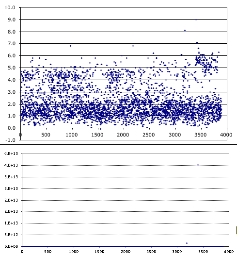
The second chart is identical to the first except it plots the energy released rather than the magnitude. On this chart only two quakes of nearly 4 thousand are notable, not even the aftershocks. None of the quakes in 2000 were this large. Makes me wonder what Mother nature is capable of.