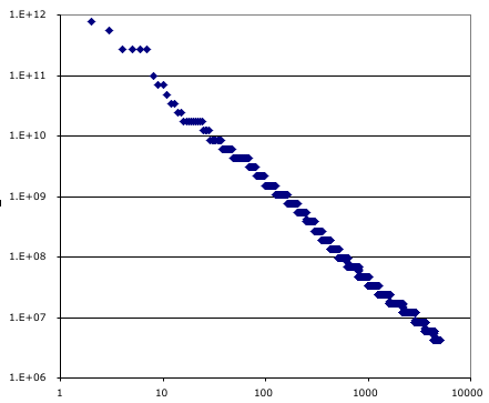
 The chart on the right shows one point for each of the top five thouand earthquakes in the united states during the year 2000. The largest was a magnitude 8 and appears in the upper left and is plotted as rank one on the horizontal axis (well, it would if I hadn’t dropped the top point, so the second largest is in the upper left). The smaller the earth quake the larger it’s rank order on the horizontal. The vertical axis is the energy released by the earthquake, estimated from the reported magnitude. This grainy look of the plot is because the magnitude was reported using only two digits. The data is from here.
In conclusion the distribution of earth quake sizes is a power law. The social network of dirt?