As an advocate for the power-law distribution one frustration is how difficult it is to visualize. You can use examples like Mark Twain’s delightful description of evolution: “Man has been here 32,000 years. That it took a hundred million years to prepare the world for him is proof that that is what it was done for. I suppose it is. I dunno. If the Eiffel tower were now representing the world’s age, the skin of paint on the pinnacle-knob at its summit would represent man’s share of that age; & anybody would perceive that that skin was what the tower was built for. I reckon they would. I dunno.” I.e. those at the top of the power-law wealth distribution it makes no sense to bend over and pick up a thousand dollar bill.
We generally assume that things are distributed uniformly. The rain, for example, falls reasonably uniformly overy my back yard. These systems with power-law distributions aren’t like that. They are more like some freak storm passing by and dropping all it’s rain into a bucket in my yard.
One of the classic examples of a power-law distribution is the size of cities and towns. Stop and think what that means. It means that every time you look at a geographic map of which displays some human activity your being horribly mislead. Because humans are spread out evenly like the rain in my backyard. Instead they are all concentrated in a handful of buckets. In New York, Paris, Hong Kong, etc. etc. large regions of the city have from a quarter to a million people per square mile. It is as hard to think about that as it is to think about men who’s income is so high they ought not reach down and pick up a thousand dollars.
It’s no help trying to address this problem by telling outlandish stories like the ones above. The listener’s mind just locks up and switches over into denial. For example, if I say that social networks are power-law distributed what should you immediately think? You should expect to find people who’s place in the social network is like the lower east side of Manhatten; who are like the skim of paint on top of the Eiffel tower. Can you think about that?
If people can not think about these distributions what is one to do? If people can not get into their head any reasonable model of rich the rich are, or how dense real cities are, or how long evolution takes how can we expect to work thru the consequences of these facts?
Visualization of data is one possiblity. One possible technique is the cartograph. For example here’s a nice short article by the Mark Newman that tries to give a more accurate visualization of the last election.
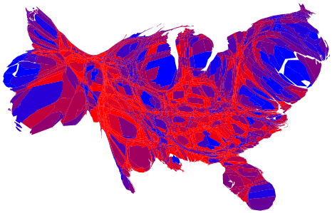
A drawing like that is just barely accessible. Notice that how you can see San Fransisco bay on that map. Notice the scale of Long Island.

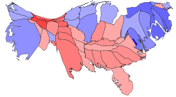
That map was drawn using technique outlined in this paper. That paper includes some wonderful examples of how hard this kind of visualization is. For example here are two maps of the 2000 election. The more distorted, and hence somewhat more accurate, map reflects a more accurate model of were the population lives. New York, New Jersy, Massachusetts, and Pennsilvania all become distorted to show where they have urban centers. But even maps like this can’t quite capture how dense the population really is in places like Manhattan.
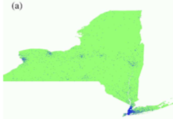
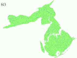
That paper also has a very nice example of how important it is to get this right. In this example we look at cancer cases. In the first drawing we can see that if your looking to find somebody with cancer you’d best go to NYC. But that is an entirely different from saying that NYC is a place where your likely to get cancer. In the second drawing the incidence of cancer looks almost entirely independent of population density; just the slightest sign that Love Canal near Buffalo and the poor districts of upper manhatten and the south Bronx might be problem areas.
But again second map certainly doesn’t look at all like New York State. In fact it’s proably a good rule of thumb that when visualizing data about human society if the drawing bears any resemblance to something in the physical world your probably about to be mislead.
This is the problem. How can we get people to think constructively about systems that are inherently hard to think about?
The visualization is accurate if what you are optimizing for is pure population density. But the system we have wasn’t intended for direct representation of each individual. Instead it was meant to be a confederation of individual states. Given that goal the electoral college is actually a fairly good way of allowing population to be represented without negating the representation of states. Many, like myself, lament the passing of the 17th ammendment and really wish it would be repealed since it dilutes the power of the states so much that you get things like unfunded mandates and severe disparity in federal funds to states.
Given the whole red/blue state thing (regardless of how its represented graphically) I really think the key to America’s ‘sane’ future is in a renewed commitment to federalism.
It’d be even more interesting to see city boundaries marked on the maps.
The Urban Archipelago demonstrates that this isn’t North vs. South, United States of Canada vs. Jesusland. It’s city vs. rural.
And we should act on that knowledge.
Yep. If you look at the Atlanta metro area for example the only thing that is blue is Fulton, Dekalb and Clayton. Looking at all of Georgia you see blue only where major universities are and in what Alabama calls the “black belt”. Its a line that extends through Alabama and into western Georgia and corresponds to the poorest parts of the state that are still primarily agricultural. I predict that by the next election even those will go Red unless there is a conservative Southern Democrat on the top of the ticket. Zell would have one the entire south….
Pingback: Ascription is an Anathema to any Enthusiasm » Blog Archive » Density Maps