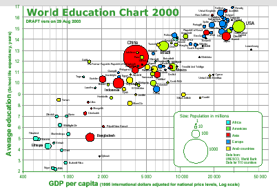
These gapminder charts are just marvelous. They are a exemplar of what we should expect from data presentation going forward. Printed data’s days are numbered.
They are also amazingly thought provoking. Just for example try out the flash based display of world income distributions. Notice how Japan’s distribution of income has become more equitable and narrow over the last twenty years. Notice how the breadth of incomes is so wide in some nations. Notice how Brazil has two peaks in it’s income distribution. Notice the same pattern emerging in the US income distirbution.
Almost all the examples are as facinating to dig into. The presentation on human development trends is particularly so. Showing as it does that the 1990s were not a particularly happy decade.
Possibly the hardest problem on the planet is how to solve the problem of third world development. As far as I can tell we really don’t know what does and doesn’t work. That’s appears to be because we don’t have very good data. What have data we have is too thin to be statistically significant. The conversation is so often confounded by various faddish adgendas. Data like that shown in these charts gives me some hope that we just might start to resolve those problems.
This link came my way via del.icio.us. It continues to please me with lots of interesting links.