This chart shows the incomes of various segments of the American population for the eighteen years from 1979 thru 1997. The top 1% is the top line. They saw a increase of 220% in their incomes. The bottom line is the income of households in the bottom 20%. They saw a 4% decline during this period. The bottom five lines display income trends for each 20% of the population; only the top 20% saw their income increase.
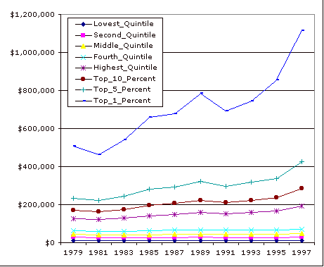
This data is taken from a report of the congressional budget office
Effective Federal Tax Rates, 1979-1997 see page page 147. Of course these are all adjusted for inflation, and are reported in 1997 dollars.
There are about 100 million households in the US, so there are about 1 Million households in the top 1%. I suspect the comparative advantage of the top tenth of a percent is better yet again, etc. etc.