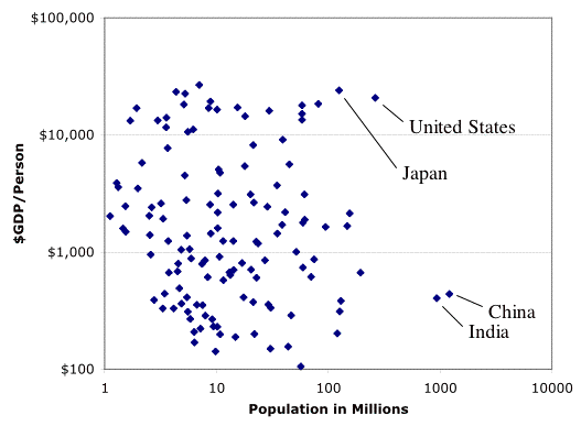
This chart has one dot for each nation on the planet. One axis shows how many people live in that nation. That’s why China and India are on the far right. The vertical axis shows how productive that nation is, per person, so that nations like the US, and Japan are near the top. This is a log-log graph, so there are huge variations across its span.

Nothing about this graph tells you how evenly the is wealth distributed within those nations.