Today’s chart is not a log-log graph. The horizontal axis is years. This wonderful graph is taken from William Nordhaus’s marvalous essay on the progress of computing (click here (pdf)).
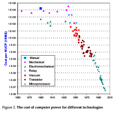
Since the switch to (massless) electronics for computation this progress curve has been remarkable smooth – in the long term. I wonder if there are other progress curves with similar long term growth rates. For example is there one for the age of machines – steam, transportation, machinery, etc. – or the for measurement say. Graphs like this are generated by processes that grow a certain percent every year – 50% a year since 1940 in this case. Growth like this – in fundimental inputs to the economy – are what drive economic growth.
This sharply falling cost curve has marched thru all the industries where information handling is significant element of the biz. Each has sooner or later had to be completely disrupted and remade anew. For example along the supply chain. Huge displacments: not a lot of office supply salemen any more. Huge generators of wealth: Wal-Mart’s market cap is 243 Billion dollars.
My thanks to Brian DeLong for the pointer (click here).