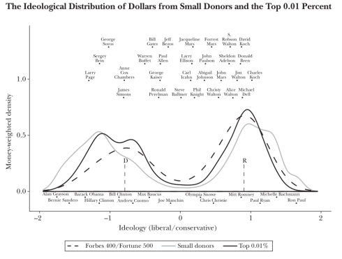
Interesting chart.
It give a glimpse at how and which of the mega rich spend a on our elections. It would be interesting to see a similar chart about the lobbying of their agents. I’m surprised how sorted this is by the age of the Lord’s empire.
That’s the last slide in this deck (pdf) from a year ago. The entire deck is a nice summary of the state of our frighteningly polarized politics.
