This chart is lifted, and slightly edited, from a post discussing how much land area it’s going to take to generate power from wind or solar. No surprise there, fossil fuels are amazingly dense sources of energy.
In any case the horizontal axis is showing how large various things are. There isn’t really anything surprising along that axis. Hydro systems are large, solar panels are small. Cities are bigger than houses! The red regions are demand energy, the blue regions are ways of supply in. The vertical axis shows how concentrated the flux of energy flowing in or out is. Oil fields and power plants have very dense energy flows; while plants and hydro-electric impoundment areas don’t.
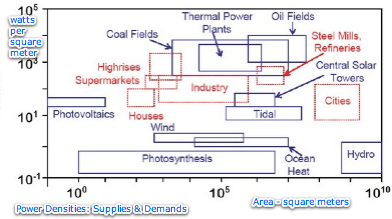
This suggests that one big change that will come if we step back from fossil fuels is a change in which side of the energy distribution system consumes the most real estate. Right now 10 to 100 times more real estate is used on the demand side, and afterwards it might be 10 times more on the supply side. That is quite a flip.
I love this kind of chart, i.e. big broad overviews.