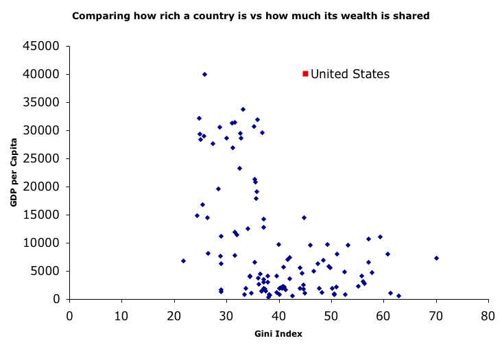
Interesting chart (By way of some nice ranting by Dr. Traven.):

I didn’t click around enough to see the data sources. I presume that’s Japan up there on the left. I’d not seen this before, so I’m suspicious. Also, given how hard it is to pull a meaningful average out of a highly skewed distribution, like the wealth distribution, I’m always a bit uncertain what to make of a concept like GDP per capita. For example, there are huge number of people in the US who make less than 10K/year.
If this was all you knew, and you want’d to raise GDP you’d start by addressing inequality.
“If this was all you knew, and you want’d to raise GDP you’d start by addressing inequality.”
Well, you might if you knew for certain that inequality was the cause and high GDP was the effect, something that that graph doesn’t really indicate.
David – That correlation is not causality is all well and good. It is no help if you actually wish to act. So, at times, raising it is a device for undermining action and encouraging delay.