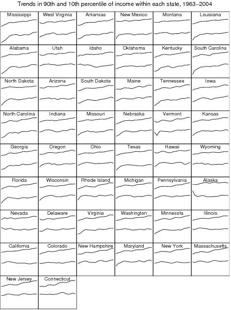
This chart is so cool, that I can’t resist in-lining it directly; I hope it’s creator doesn’t mine. The states are sorted poor to wealthy, vertical scale is log of constant dollars. The upper lines are the median income of the top 10% while the lower lines are the bottom 10%. Horizontally shows 40 years. If the lines grow closer together, as they do in some of the poor states, income inequality is declining. Contrast that to some of the wealthier states. Note that there are a number of reasons arising from the highly skew’d distributions involved that make this chart a poor lens for viewing the data. For example, most of the population lives in just the few largest states (51% in the top 9) and most of the income is actually captured the top 1%.

Click thru to the original posting for some additional charts that play with this data set.
BTW, all of these graphs were made using the open source R Project for Statistical Computing (http://www.r-project.org/).