This is posting is a follow up to the posting about the shape of the author citation curve in computer science. That showed, unsurprisingly, the power-law distribution; and the interesting tempering of the inequality among the top few authors. This chart shows only the top 100 papers, their rank runs left to right and the year of their publication runs vertically. I made it expecting to see signs of preferential attachment; but you don’t.
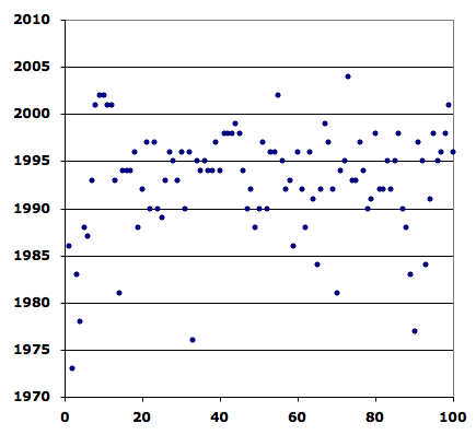
I think this is yet another example of how the elites are often a different species; but I’ll need to see if I can get a wider window than the top 100 to be sure. I don’t see why professional communities like these would be immune to preferential attachment.