Two things got me interested in power-law distributions. The first was back in the early 1980s. I was involved in a big software engineering project and the system we had built was horribly slow. Collected lots of statistics about it’s behavior; calling patterns, data structure topology, paging behavior, etc. etc. These all came out power-law distributed and I became very disconcerted that I didn’t know anything about this distribution.
So some time later when people started pointing with alarm that the distribution of wealth was growing less and less equitable. Again the power-law distribution! Hm. The system designer in me found that fascinating. Could it be that my software systems shared something fundamental with the economic system?
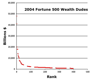
I haven’t written about the distribution of wealth much recently. The Fortune 500 survey of wealthy dudes is out for 2004. We make scatter plot the 400 wealthly dudes. That’s the first chart. (There are gaps in the data shown because my scrapping script isn’t perfect and there is only so much time I’m willing to spend working on it.) That chart doesn’t do justice to the long tail, since it doesn’t show the other 300 million dudes in the country.


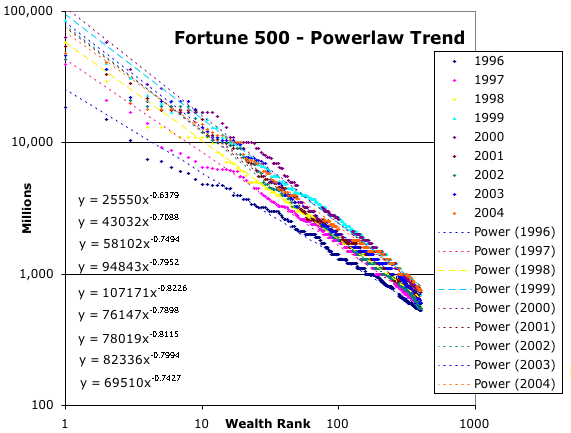
We can plot that data on a log-log graph to show that it’s power-law. More fun is to plot all the data for the last few years and look for trends. The second chart does that; along with fitted lines for each of the years. Presuming that sampling the top of the curve is a good estimate for the rest of the wealth distribution you can calculate your rank by plugging you net worth as Y into the 2004 formula and solving for X. How far out on the tail are you?
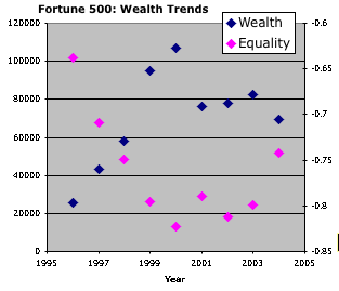
The third chart show the trend. The number I label wealth is a measure of the size of the economic pie. You can see the pie swell up during the bubble, pop and then try vainly to recover. The number I labeled equality is a measure of the severity of the distribution of wealth.