I’ve been meaning to get an example graph of the following
kind up for a while now. This illustrates how a power-law
distribution appears when plotted on the more familiar
linear scale rather than a log-log scale.
This graph shows the same data that’s discussed on in a
prior posting. Each of the 30 thousand red dots on
on this graph represents a particular last name. The
vertical axis shows how popular that name is while the
horizontal axis shows the rank for that name. For
example the most popular name is Smith. Just over
one percent of the population is named smith. Followed
by Johnson at .8%, Williams at .7%, Jones at .62%.
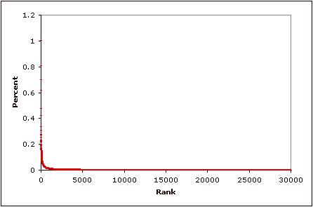
Distributions like this are very counter intuitive. It’s
as if it rained and you went out in the back yard and all
the rain had fallen into papercup. But wealth, income, words, web traffic, earthquakes, city sizes, etc. etc. are
all distributed this way.
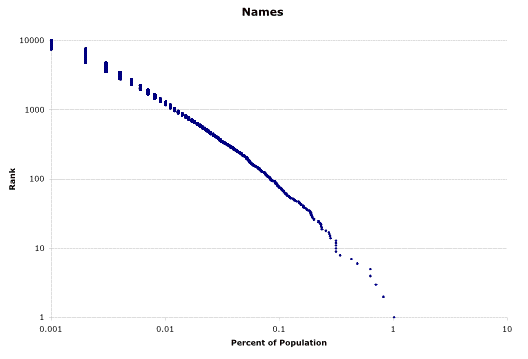
Here’s that same data plotted on a log-log graph (as shown in a prior posting):
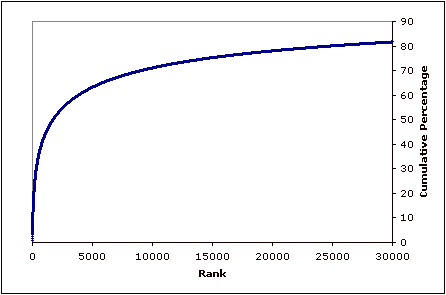
While finally here is the same data plotted showing the cumulative percentages. If every name was equally popular then this graph would be a straight line.