Two nice visualization examples.
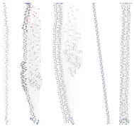
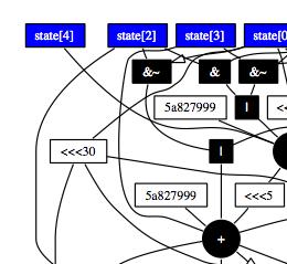
Daniel J Bernstien has a posted an extended abstract (pdf) showing some nice visualizations of assorted crypto algorithms (via Bruce Schneier). The three thumbnails below are a preview.


Fun. See also.
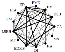
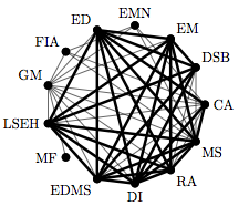
Secondly I liked this visualization of before and after pairwise correlations over time.


I don’t think I’d previously see this visualization technique. The lines denote the degree that the nodes behave similarly. This is from a paper that attempts to puzzle out what happened in the financial markets in August 2007. One hypothesis, illustrated by that chart, is that the diverse world of fund strategies ain’t so diverse after all. The industry’s strategies have been collapsing into a single uber-strategy. They checked to see how correlated the returns were between pairs. Emerging Market funds used to be only lightly correlated with Risk Arbitrage (see EM v.s. RA in the chart). Now they are highly correlated.
This is a technique that could be run on lots of time series; for example any of the many indexes available for metropolitan areas. It could also be enhanced with color and more sophisticated graph layout techniques.