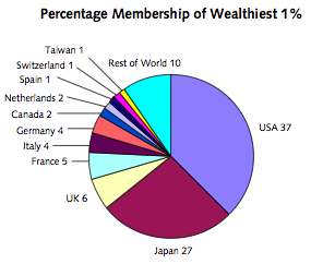
These highly skew’d distributions are extremely hard to visualize; you just can not get a feel for how vast the population of “other” is. I give some examples of that in this previous posting, using people’s names as an example.
The folks that wrote the recent report on the worldwide distribution of wealth take a run at the problem in the usual way; putting the data into various buckets. For example they know that 40% of the total wealth of the planet is held by the richest 1% of the population. We can make a pie chart showing were they live. They live in the Europe, the US, and Japan. In this visualization you can’t see the other, i.e. the vast majority of the world’s population, the other 99%; notice how China, India, Africa, etc. are all invisible on this chart.

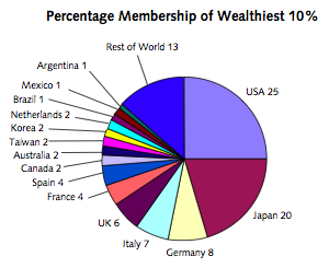
We could try to get a picture that shows these other folks by making a series of pie charts. For example we might make ten charts each showing 10% of the world’s population. For example this next chart shows the richest 10% of the world’s population; and where they live:

Korea, Mexico, Agentia, Brazil showed up; but still no sign of China, India, Africa, etc. The report’s authors found a way to address the problem by making the chart below. This chart displays a pile of similar pie charts. The first pie chart above is the chart you get if you take convert the right edge of the chart below.

So this shows that India, Africa, and “Other Asia-Pacific” house most of the world’s poorest.
But yet the visualization problems remain. Notice two things. First, that 40% of the total wealth is held by a tiny tiny sliver running along that right edge. Secondly, that these regional buckets are very misleading. Even inside those regions only a very tiny minority of the population is wealthy. See if you can figure out what slice shape denotes a higher or lower Gini for that region?