There is a lovely pattern that arises in science from time to time. You measure something, notice something, fit a model to it and discover something you really didn’t know before. It’s hard to believe that such a thing could happen in Political Science. But now it has.
Some years ago it became popular to wisely opine that there was no difference between the two political parties in the United States. The dangerous consquence of this line: “Why bother voting.”
Can we prove this argument true or false? Yes.
Some years ago Keith Poole and Howard Rosenthal asked a surprisingly simple question. Can we reduce all politics to a single number? Such a number might, for example, measure how liberal-conservative our elected officials are.
This is a statistical question: e.g. given that model how well does the data fit? A computer problem. You write, or acquire, a computer program that chews on the data and tells you how well it fits your model.
So they set out to see if they could assign a senator or congressman a number and then use that single number to predict how they would vote on any given bill.
My sense is that when Poole and Rosenthal first asked this question they assumed that answer would be a “no, not really.” I think they hoped that later when they added a few more numbers to measure a representative’s belief system then they would start to get better models. Models that fit better and better.
Of course any student of political science knows a laundry list of reasons why representatives vote in ways that are not well aligned with their core beliefs. Just a few examples: log rolling (voting in one period to get something in a later period), party loyalty (voting with the party to gain the benefits of loyalty), pork barrel (voting to benefit your region), bribery (voting to benefit those who paid for your campaign), etc. etc.
Poole and Rosenthal took the historical record of votes in the Senate and tried to fit their very simple model to it. The idea was that every representative would get a number and every bill they voted upon would too. The bill’s number would slice thru space of Senators and those on one side would vote for it, and those on the other side would vote against it.
For example Senator Lefty might have be assigned -2, and Senator Righty might get assigned +3. If a bill was slightly to the right at 1, then Senator Right would vote for it and Senator Lefty wouldn’t. But a bill that was extremely leftish, say nationalize the computer operating system business might be at -4 and niether of them would vote for it. Pretty dumb model huh?
The statistical problem, the one they handed over to the computer program they wrote, is to find the best numbers for all Senators and all the bills. The model that generates the fewest errors. If you get a lot of errors the model is crummy, if you get a few then the model’s pretty good.
You want it to find the best definition of left/right. When doing this you don’t want to bias the program’s output. Notice that if you have 50 senators and you want to put them in order from left to right there are N!/2 possible orderings, or around 10 with 64 zeros following it, that’s a big space to search. Between 1789 and 1985 the Senate held around 40 thousand roll call votes. That’s around 2.3 million times some Senator made a decision. This must have been a fun program to write.
One reason they started with such a lame model was that the problem is so huge. The second reason they did the project was they were offered time on a big computer and they were looking for a Political Science problem to tackle.
What Pool and Rosenthal found was that they could use a single number to explain around 82% of the votes. They must have been amazed.
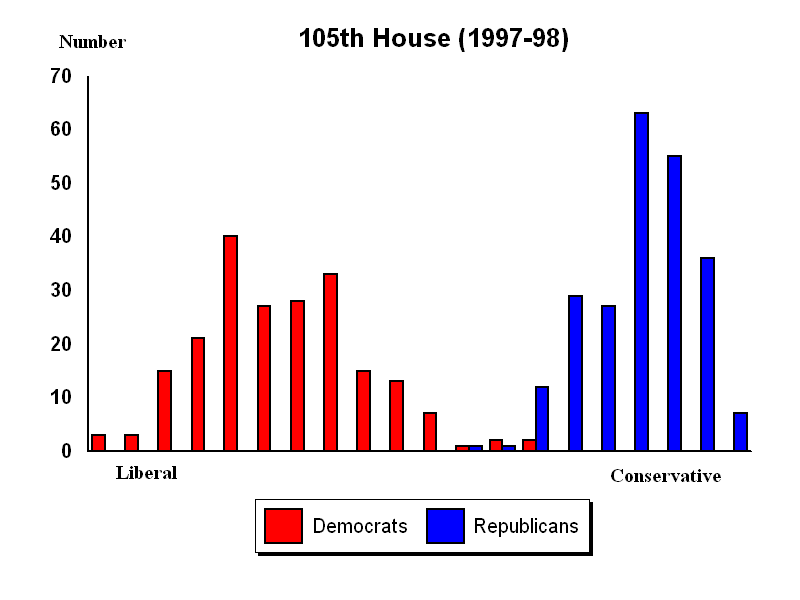
Here’s an example. This chart (taken from this paper) shows the distribution of representatives in the congress in 1997-98.

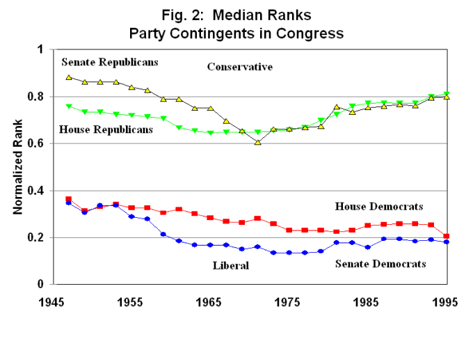
You can also plot the data over time, as shown in this graph (take from this paper) of where the median of each party’s representative is from 1945 thru 1995.

Later when computers got bigger they were able to try two and three numbers. They are very slightly better. Adding a second dimension only improves the model’s fit by 2%, but it adds a lot to our understanding of the what these numbers mean.
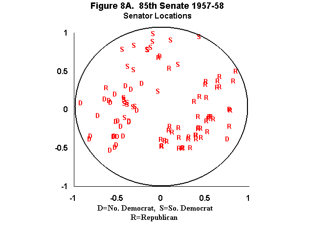
Here is a chart (taken from this source) plotting the position of all the senators in the 85th senate. This is 1957-1958. The civil right’s movement was on the horizon and all hell is about to break loose. The R points are republican senators, D are democratic senators, and S are southern
democratic senators. If you were designing a bill to get it past this senate then you would craft it to slice the space thru the middle with line slightly tilted clockwise.

Of course to design your bill you’d need to know what the axes mean. The computer won’t really tell you that. It just found a model that fits. What do they mean? Some guesses might include: liberal/conservative, north/south, black/white, poor/rich, democrat/republican, urban/rural. Clearly we could go on and on!
Well it turns out that the horizontal axis is about the regulation of commercial activity. Goverment does many things that structure the markets that commercial activity takes place within. Setting standards, printing currency, writing the regulations. The key to the left/right axis is the extent such regulations serve small vs large players in the economic arena.
Consider a bill that regulates industry to make the workplace safer. When crafting the bill we could decide to have the bill affect all companies with more than 100 employees, or alternatively all companies with more than 20 employees. The representatives on the left will prefer more worker safety, the ones toward the right will prefer less industrial regulation.
It turns out that for most of American history the vertical axis is about race. The southern Democrats on that chart are were once called “dixicrats”, they supported regulating commercial activity, but they didn’t have much enthusiasm for voting rights for black citizens.
I can not even begin to enumerate how amazing this work is. For example there are numerous widely known models of how politics is played in this country. Models that this data allow you to check. For example it’s widely assumed that representatives on a given committee don’t represent the position of the congress at large because they have special interest in the work of the committee. The model show that’s not true. For example it’s widely assumed that representatives shift their positions over time as the opinions of the general population shift – that’s absolutely not the case. In fact it appears there is really nothing as consistent as a representative.
The hardest idea to get your head around that this model implies is that any issue, the environment, for example must be projected into this model before the vote takes place. There is no such thing as a highly pro-enviromental right wing representative!
The model also allows them to watch the congress evolve over the centuries. To see when there were significant shifts in the population of representatives; and hence upheavals. You can see periods when the two parties overlap; and periods when they are highly partisan. For example the parties grew very partisan running up to the civil war, and we are currently living in a period that is the most partisan since that time.
The book is not for the casual reader. Someday soon, hopefully, a more accessible popular version of this will come out. To get a taste for how the book reads you can read this
article about the recent mess that Senator Trent Lott got himself into.
“If you were designing a bill to get it past this senate then you would craft it to slice the space thru the middle with line slightly tilted clockwise.”
If a clear majority is on your side of the gap! Otherwise it might be best to cut perpendicular to the gap: you’ll defy labelling and bewilder your opponents.
“The key to the left/right axis is the extent such regulations serve small vs large players in the economic arena.”
Where `serve’ means `are [naïvely] perceived as serving’, of course.
But that’s not what the Green Party reprensetative told me! I’m sure, after reading this, they’ll change that opinion.
“If you were designing a bill to get it past this senate then you would craft it to slice the space thru the middle with line slightly tilted clockwise.â€
This middle ground balances the two paired sets of polarizing issues. Regulate smaller businesses that employ white workers, but don’t regulate small businesses that employ minority workers.
I suspect if you looked into bills you’d see a lot of exactly that kind of horse trading going on. One one of the community of sites around the vote view stuff there is a regularly updated video showing the cut lines for recently passed bills along with those representatives who voted contrary to the model. What surprised me is how often bills have unusual slopes.