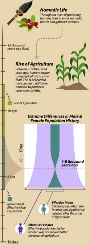
 So here’s a chart from an illustration by Sabine Deviche, it’s taken from here. It covers deep time, the axis on the left is in units of a thousand years. The interesting bit is the 2nd chart in the middle. It shows “effective” men (green) and women (purple); where by effective we mean that they managed to pass their genes onto the next generation.
Something happen to the men.
At some point the number of men who managed to pass their genes along declined to a vanishingly small percentage of the total population.
But this didn’t happen to the women.
Most of the men disappeared, at least they didn’t show up at the prom.
“4-8,000 years ago there was an extreme reduction in the number of males who reproduced, but no in the number of females.”
What the hell?
You can see the whole illustration here, and read more here. The paper is inside a walled garden. Or maybe you’ll enjoy this headline:
“8,000 Years Ago, 17 Women Reproduced for Every One Man.”
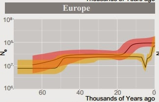 This blog post offers this view, showing the event for various regions. The women, in rose, always reproduce more dependably. But 15 thousand years ago their effectiveness increases substantially. And then around six thousand years ago we have this event that reduced the reproductive success for men.
When it happened, how radical it was, and how long it lasted varies from region to region. it’s hard to see how to explain this without blaming social forces: culture, technology, economics. Fun to make up insta-theories.

