In the 1930s a traffic engineer in England noticed a curious pattern in the data about highway deaths. Here is the chart from the article he published.
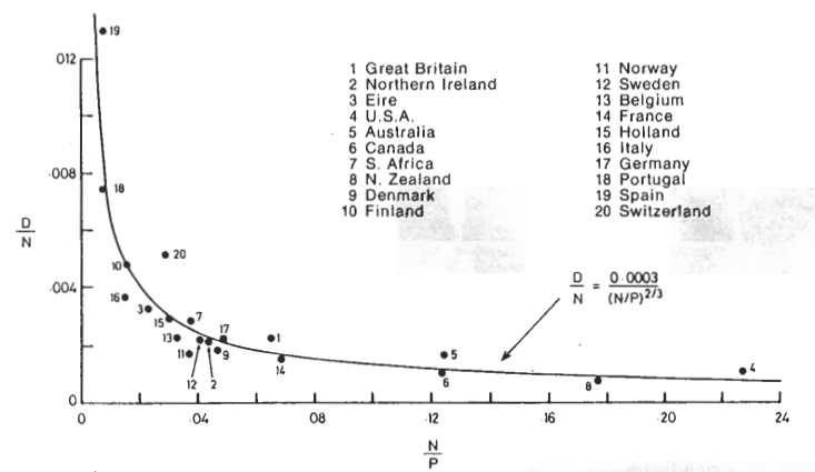
The vertical axis shows deaths/car and the horizontal shows cars/person with one dot for each country. That’s for 1938. In 1938 few people in Spain(19) owned a car, but those that did were causing a lot of deaths. Switzerland(2) wasn’t fitting the model very well. You can make up your own insta-theory for why countries with few cars/person kill more people with each car.
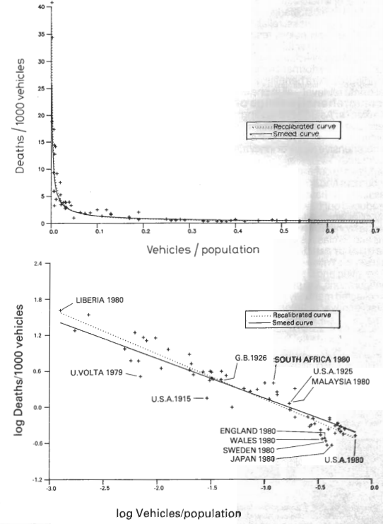
Here’s a chart from 1980. More countries, more years, more confirmation of the model. The data are shown twice, the second time is a log-log graph.
Note that there are lots of things you might think would affect the numbers for a given country. For example: seat belts, population density, driver median age, safety regulations, insurance, policing, road quality, dash-board cams… But those aren’t part of this simple curve and so can only effect the residuals.
I stole these charts from J.G.U. Adams short article “Smeed’s Law: some further thoughts” in Traffic Engineering and Control, 1987
I find this all weird. You would think the traffic engineers would have a polished consensus by now of what this is saying. Adams’ article has some interesting things to say. For example societies learn to manage the cars as their numbers increase. But I don’t sense there is a consensus in the profession. Even now, 80+ years after the pattern was first noticed.
The explanation is quite simple: Traffic death is a function of speed, and speed is a function of traffic density. The effect applies for nighttime or weekends, too, when traffic density is low.