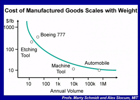
I love charts like this.
This chart implies that if you want to know what it costs to make something all you need to know is how much it weighs and how many are produced. Note also that this is my favorite grid: log-log. So, you get quite a large factor in the variance around that line. And then, you don’t often see that curve on log-log graphs. The chart is taken from Dan Nocera’s Pop!Tech talk on “Personal Energy” which makes an interesting arguement about the shape of the industry we will need to solve the energy crisis; i.e. a few very big producers should produce the capital equipment which is then run locally by billions of households; i.e. down in the lower right of that chart. He’s the guy who’s lab at MIT found a new catalyst that they claim is a game changer when it comes to splitting water to get hydrogen.
A quick search didn’t turn up the original source, presumably by Schmidt and Slocum, of that chart. Anybody happens to have a pointer, or better yet the paper?
