I’ve been playing with the recently released API for Etsy, and here is a chart of questionable value.
Each dot represents a single shop on Etsy. The vertical axis shows how many items they have sold. The horizontal axis is a very rough estimate of their average price.
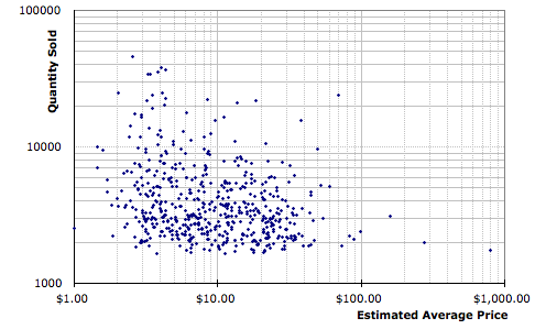
This is pretty bogus. Some reasons why: I drew my sample from a list of high volume shops; If I had a list of high grossing shops I’d have gotten more points in the lower right. The estimated average price by sampling current offerings. E.g. shop at the lower right probably has an average selling price of around twelve dollars, in spite of having a number of two thousand dollar items in their shop. The data is not per-year, but rather since the shop opened.
Lots of things come to mind. For example, the cost structure of shop in the upper left (mostly fulfillment I assume) is quite different from those in the lower right.
That said it doesn’t seem implausable that there are a few hundred shops that gross more than fifty thousand a year at Etsy. Maybe, there are a few who’s profits are above that level.