Monthly Archives: October 2007

Visualization

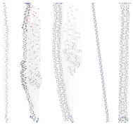
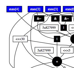
Two nice visualization examples.

Daniel J Bernstien has a posted an extended abstract (pdf) showing some nice visualizations of assorted crypto algorithms (via Bruce Schneier). The three thumbnails below are a preview.

crypto3.png crypto1.png crypto2.png

Fun. See also.

Secondly I liked this visualization of before and after pairwise correlations over time.

corr1.pngcorr2.png

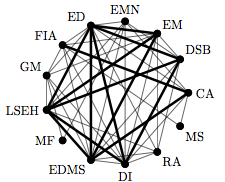
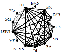
I don’t think I’d previously see this visualization technique. The lines denote the degree that the nodes behave similarly. This is from a paper that attempts to puzzle out what happened in the financial markets in August 2007. One hypothesis, illustrated by that chart, is that the diverse world of fund strategies ain’t so diverse after all.  The industry’s strategies have been collapsing into a single uber-strategy.  They checked to see how correlated the returns were between pairs.  Emerging Market funds used to be only lightly correlated with Risk Arbitrage (see EM v.s. RA in the chart).  Now they are highly correlated.

This is a technique that could be run on lots of time series; for example any of the many indexes available for metropolitan areas. It could also be enhanced with color and more sophisticated graph layout techniques.

Artistic Praxis

Here’s a nice sentence template:

“This mechanism is called Z and Z is a pivotal driver of Y.  See W for an approachable introduction to the theory of Z. But be forewarned that there is a lot of artistic praxis involved as well.”

I’ve always liked the word praxis, or “practice or exercise of a technical subject”.  It also has a common usage in political theory naming the puzzling part: how to connect your grand theory of the world to practical application, or “that through which theory or philosophy is transformed into practical social activity.”

The original of sentence which I distilled that template was about financial futures.  It is a nice example of the two meanings playing off each other.  The practitioners of a craft are all about praxis, and are likely to scoff at contents of W; while readers of W are likely to find that they can’t quite make actionable the lovely theory found there in.

Daddy’s rich and momma’s good looking…

From a press release

For example, low-income households, or those at the 10th percentile of the income distribution, spend approximately $8,900 per year per child, while high-income families, or those at the 90th percentile, spend $50,000 per child.

I find that hard to believe.  Where do people in the bottom 10% find $9K/child/year?  According to this report from the BLS the top of the bottom 10% make $163/week (“Usual weekly earnings of wage and salary workers, by upper limits of … deciles …”); though I have my doubts about the correctness of just multiplying that by 52 that’s $8,476 per year.  Maybe that number includes the transfer payments for what ever actually reaches the child via food stamps and public education. For comparison that BLS report leads one to conclude that $59,228 is the 90% annual income.  These are 1999 dollars, and salaried workers.  Of course the real explosive growth in the income distribution happens after the 90% level.